Witchcraft Website


For this in-class project for Introduction to Web Design, our goal was to present the information given in a chaotic and cluttered Wikipedia page in a simple and digestible manner, making an informative website that is easy to navigate.
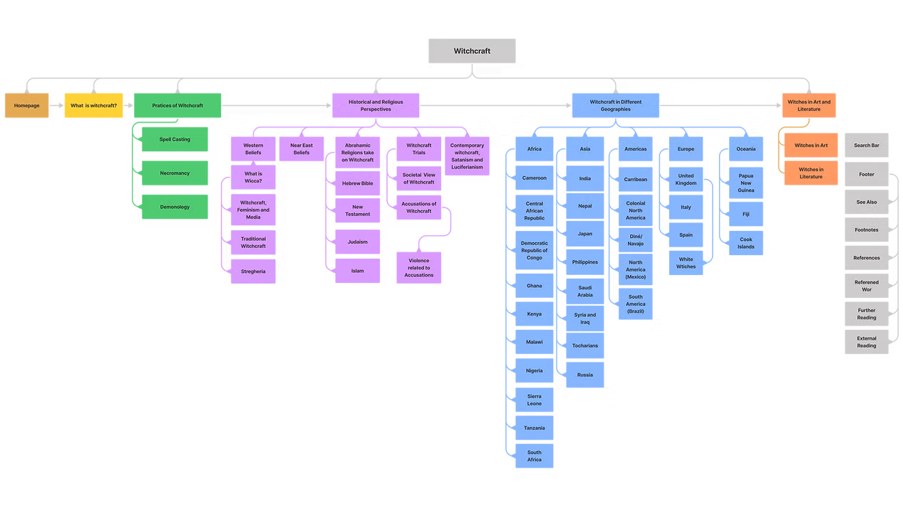
There were a lot of issues found in the original information architecture shown below that made the witchcraft Wikipedia page (https://en.wikipedia.org/wiki/Witchcraft) less user-friendly and hard to follow. For instance “White Witches” is not a practice of witchcraft. Therefore it deviates from the match between the system and the real world heuristic. There is also no guidance or helping documentation on how to cruise all the information. The user is expected to simply scroll down. However, some sub-sections require understanding other subsections to make sense. For instance, the section “Accusations of Witchcraft” would not make much sense to the user if they did not know why witches and those who practiced witchcraft were feared. There is a section explaining exactly this called “Societal View of Witchcraft”. However, the subsection is hidden way below, under “By Region” and “Russia.” To summarize, the user experience is not satisfactory as more work falls onto the user to go and extensively scroll to search for the information they are looking for. And when they do manage to find it, it might not make sense in the context because the information is misplaced in the information architecture.
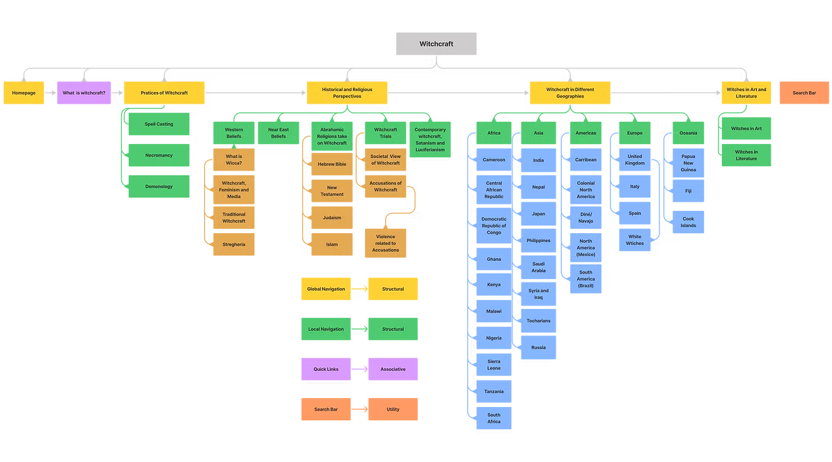
Mapping out the initial structure of the information architecture of the witchcraft Wikipedia page.
Based on the content of the site I created three personas that represent the users that are most likely to engage with and use the website.
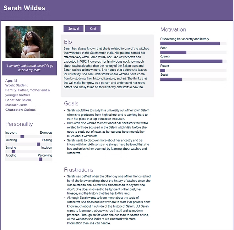
The persona Sarah Wildes illustrates is a young adult that is trying to get a sense of her identity which is a common goal in her age group. She does not view learning about witchcraft as a fun side hobby. For her, learning about witchcraft is a path to discover her past and shape her identity. That is why she takes it very seriously and would be a prime use of the website.
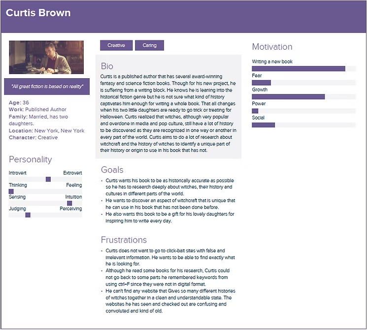
Curtis Brown represents the professional demographic that would use the site for business purposes. Writers spend a great deal of time researching the topics they want to write. To do this research thoroughly, Curtis will need to find a website that presents information in a professional and non-chaotic manner. This will help him spend less time figuring out the website and be able to find exactly what he is looking for he is also in the target audience for the website.
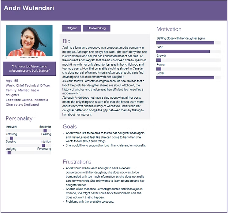
Andri herself is only interested in the subject of witchcraft because she desires to understand her daughter who identifies herself as a witch. Andri is not experienced with the topic and would like to be guided through the information she is going to learn. For all these reasons she is also in the target audience of the website
Mapping out the initial structure of the information architecture of the witchcraft Wikipedia page.
I combined the titles “Concept”, and “Etymology and Definition” in the old IA that were both talking about what witchcraft is and how it originated. Now it is a simpler page called “What is witchcraft?”. As the scholarly and niche jargon is reduced, now it sounds much less technical and more of a place to start exploring the website who want to learn more about witchcraft.
Some of the personas are people that have little or no background in the topic of witchcraft like my persona Andri Wulandari for instance. Consequently, a page titled such as this appearing as the first option would guide them on where to start and adhere to the consistency and standards of the users.
Some of the personas are people that have little or no background in the topic of witchcraft like my persona Andri Wulandari for instance. Consequently, a page titled such as this appearing as the first option would guide them on where to start and adhere to the consistency and standards of the users.
Having similar page titles as “Spell Casting” and “Spells” in different locations would confuse some users like Andri as she is a persona that knows very little about witchcraft.To to avoid confusion, I removed the “Spells” page under “Russia” and combined it with the “Spell Casting” page that was under “Practices of Witchcraft”. That is why, having one page about spell casting would adhere to Nielsen's heuristic, consistency, and standards as similar information is not given in two different places but combined in one location.
In the old IA, the section “Wicca” and its subsections fell under “Overview”. However, for someone not familiar with the concepts and history of witchcraft a bizarre jargon like “Wicca” might confuse the user. To prevent this I changed the page title from “Wicca” to “What is Wicca?” and put it under the “History and Religion” options. This signals to the user that Wicca is either a historical or religious perspective taken on witchcraft.
Another major change was moving the page “Witchcraft Trials” from under “Russia” into “History and Religion”. Since witchcraft was viewed as “evil” or “unholy” by most in history according to the Wikipedia page, the witchcraft trials were a means to capture the suspects associating with witchcraft. It is an important part of the history of witchcraft and witches, especially for one of my persona Sarah Wildes as she is intending to discover mover of the history around witch trials.
Another change was made in the title of “By Region” in the old IA. This page title was very vague and was prone to confuse users. As the content pertained to the witchcraft practices and history in different parts of the world, I renamed it “Witchcraft in Different Geographies” clearly signaling the users that they will find specific and niche information about the specific geography they are searching for.
For a persona like Curtis Brown who is researching his upcoming book, this is crucial as he would like to search all the intricate origins and stories of witchcraft before he picks a concept that he likes.
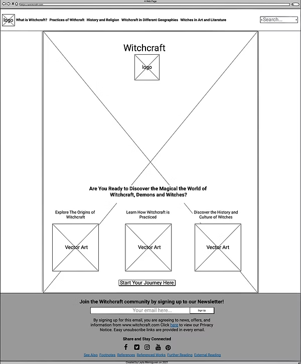
The wireframe design for the homepage is simple and uncluttered yet has enough textual and visual content to make the users understand that this is a website that will teach them about witchcraft.
From the global navigation bar, the users can see all the options available for them which are five main titles, which is ideal for global navigation. A search bar is also included in the navigation bar to aid users that have a specific concept in mind and can search the page for it. The search bar might be more useful for the persona Sarah Wildes who is mainly interested in learning about the history of witchcraft in Salem and North America. She can type in phrases like “Salem” and “Salem witches” into the search bar to get more information about them.
For Curtis, who is interested in making use of a witch culture and lore that has not been done before, he might make use of the “Witchcraft in Different Geographies” and look up the lore of witchcraft that has not been overdone in Western media like European or North American witches.
The page is decorated with a big background image and vector art that illustrates a summary of what the users will find on the website.
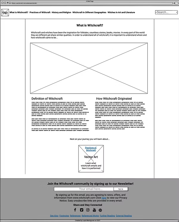
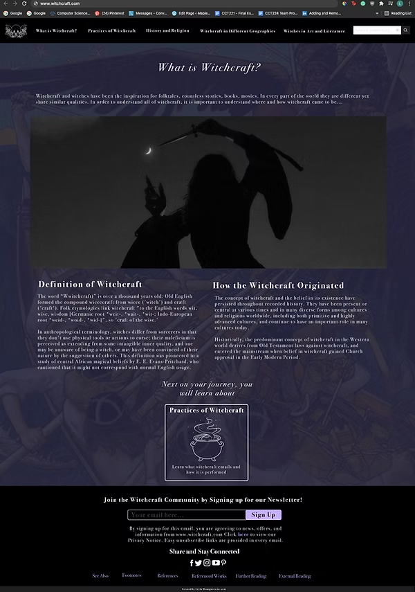
The “What is Witchcraft?” page is specifically designed for users like Andri, as it walks the user step by step in a simple understandable language free of jargon of what witchcraft is. This is probably the first page a user like Andri will see after the Homepage as there is a button called “Start your journey here” that links the Homepage to the “What is Witchcraft?” page. Within the “What is Witchcraft?”
There is an embedded button at the bottom that will take the user directly to“History and Religion”. This helps users maintain a flow while interacting with the website, and not have to think about what page they need to visit next as the options are already provided to them. The order flows naturally from more pressing questions like “What does witchcraft entail?”, “ What was the societal view on witchcraft?”, to less pressing questions that some users like Curtis might be interested in like “How were witches different in different geographies”, “How did they affect art and literature?”.Fixed on every page are the global navigation, search bar, and footer.
Global navigation helps users that know exactly what they are looking for and enhances flexibility and efficiency of use. Users just exploring the page can go back and forth without issues at their leisure and the footer with the sign-up box adds an element of connectivity. Here, they can sign up for the website’s newsletter, check out the social media, and also the reference links that the page uses
High fidelity wireframes of the Homepage and What is Witchcraft? pages.
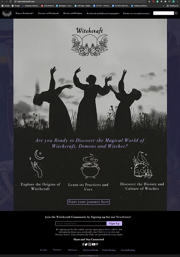
I used a purple and black color palette as purple is associated with wisdom, dignity, grandeur, mystery, and magic, and the color black is associated with power, elegance, and mystery (Hoekstra, 2020). Since the subject of the website is witchcraft, using such colors helped convey a mysterious, magical but also elegant and feminine atmosphere. The photographs used are all black and white and also are of silhouettes of women dancing or performing rituals in nature. Their faces are concealed so this also adds to the element of occult and supernatural feeling I was trying to instill.
The large image used on the homepage is of three women dancing in a field. This is specifically chosen as a reference to the triple goddess moon symbol. This symbol is also what inspired the logo of the website since it is sacred for anyone practicing witchcraft and represents their religion with each of the moons representing a phase of womanhood and feminine power. The first crescent moon represents, “the maiden” which is a woman in her adolescence, the second full moon represents “the mother” which represents a woman that is with a child, and the third crescent moon represents “the crone”, which represents an old and sage woman. The extra leaves and flowers added to the logo are to indicate the connection between witchcraft and nature.
The vector images used are all my designs drawn on photoshop. I decided it was best to use simplistic illustrations to tell a story and show what the user can accomplish on this website with simplified images. For instance, in the homepage above the “Learn its practices and uses” text, there is an illustration of a smoking cauldron, helping the user understand that they will learn about potions, herbs, and magic. The faded image chosen for the background is the illustration known as “The Defense of the Sampo” made by Akseli Gallen-Kallela in 1896. This image is talked about in the section of “Witches in Art and Literature” and also goes with the aesthetic of the website.
The main font chosen for the website is Bodoni 72 Oldstyle from the Photoshop default fonts. This font was chosen because it was elegant and simple while also being stylistic to convey the element of femininity. Sometimes the titles are italicized and boldened to draw attention to certain headings.