Research
I conducted user interviews with five participants to understand the common challenges people face when trying to locate grocery items in local or unfamiliar stores.
Personas
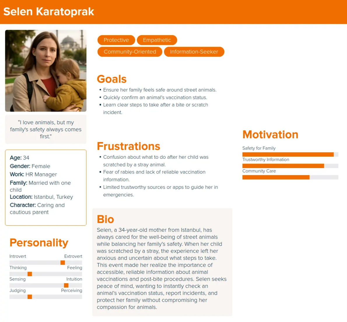
Based on the user interviews I conducted, I synthesized the data to create three personas that represent the target audience for the product.
Selen's User Story
As a parent, I want to know whether a street animal is vaccinated so I can feel safe around it.
As someone whose child was scratched, I want clear guidance on what steps to take after a bite or scratch so I do not panic or guess.
As someone who forgets which outfits worked, I want to save past looks so I can reuse proven combinations for future events.
As a cautious user, I want to quickly find the nearest hospital or veterinary service so I can act immediately in an emergency.
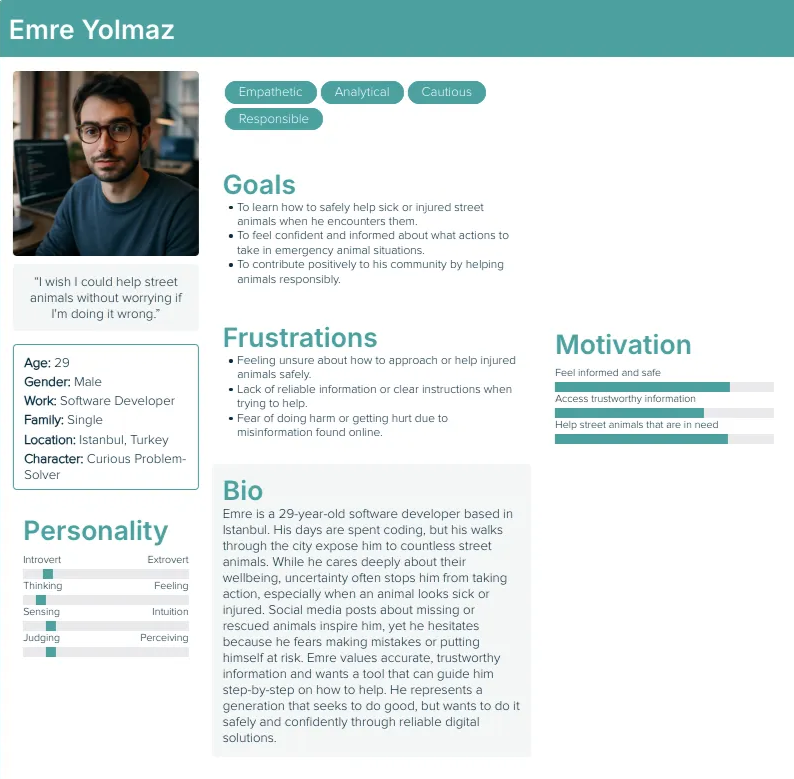
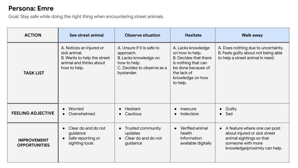
Emre's User Story
As someone who encounters street animals often, I want reliable information about an animal's health status so I can decide whether it is safe to help.
As a bystander, I want clear instructions on how to help a sick or injured animal without putting myself at risk.
As someone who sees missing animal posts online, I want a way to report sightings or access verified information so I can help without feeling helpless.
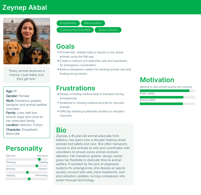
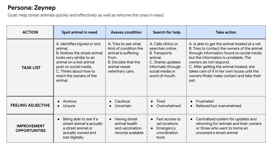
Zeynep's User Story
As an animal advocate, I want quick access to vaccination and health records so I can help animals efficiently.
As someone who responds to emergencies, I want to find nearby veterinarians and treatment options fast so I do not lose critical time.
As a frequent helper, I want a trusted system to share updates and coordinate care or rehoming with others.
User Journey Maps
I created user journey maps to understand the actions and feelings of the users going through challenges to better understand how to solve their problems.
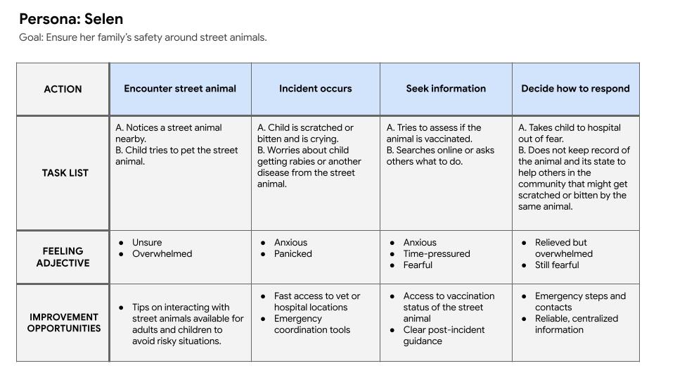
From the user journey maps I was able to extrapolate problem statements and hypothesis statements for both of the potential users.
Problem Statements
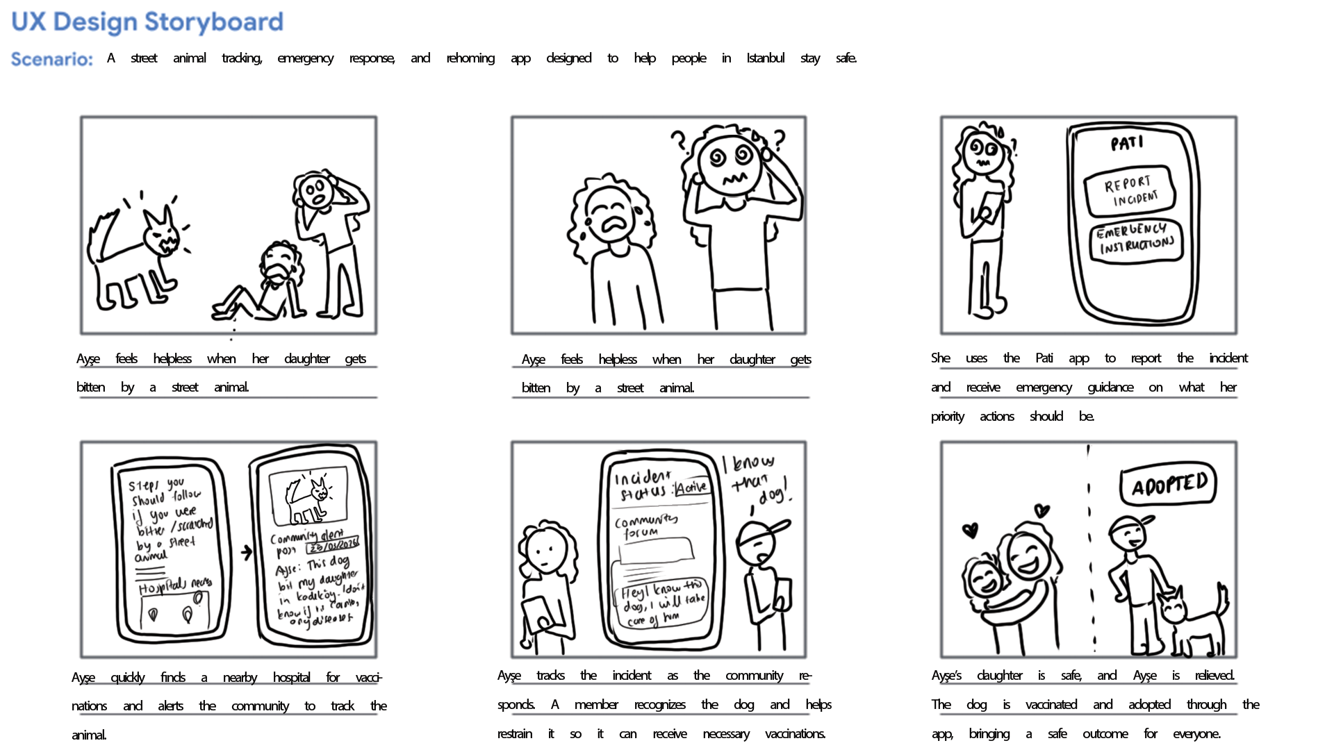
Selen needs a way to quickly understand whether a street animal is vaccinated and what steps to take after a bite or scratch because uncertainty around animal health causes fear and panic and leads her to act out of stress rather than confidence.
Emre wants to help street animals but lacks trustworthy information and clear guidance, which causes hesitation and prevents him from taking action even when he wants to do the right thing.
Zeynep needs faster access to reliable health records, veterinary services, and coordination tools because time lost during emergencies and scattered information makes it harder for her to help street animals effectively.
Hypothesis Statements
If Selen can easily access reliable vaccination information and clear post-incident guidance, then she will feel safer around street animals and respond more calmly and effectively in emergency situations.
If Emre is provided with simple, reliable instructions and verified animal health information, then he will feel confident enough to safely assist or report animals in need.
If Zeynep can access centralized animal health data, nearby veterinary services, and a trusted coordination system, then she will be able to respond faster and improve outcomes for injured or sick street animals.
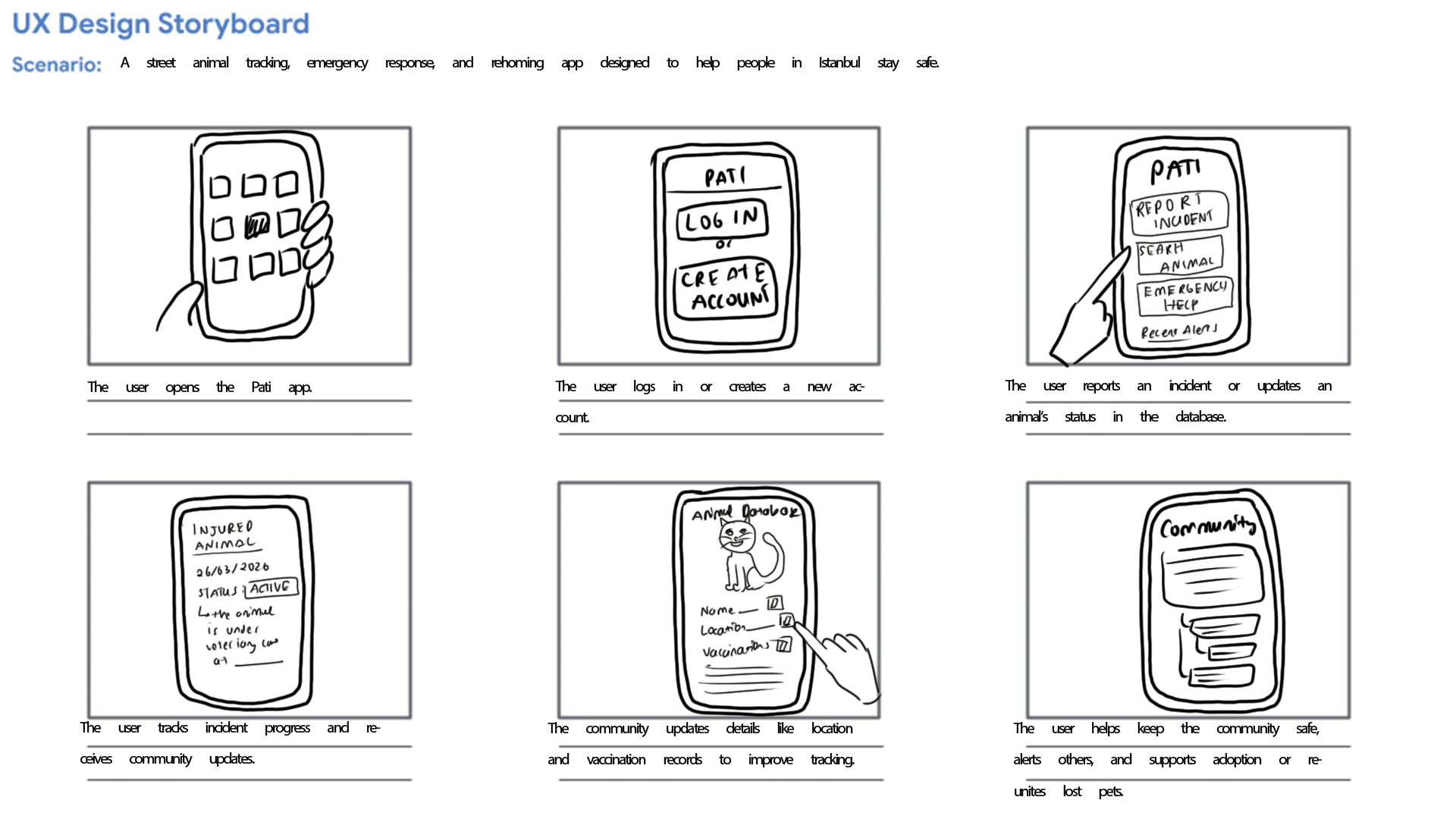
Storyboards
From the problem statements created I was able to create a big picture and close-up storyboards to empathize with and the user and their pain points.
Initial Designs
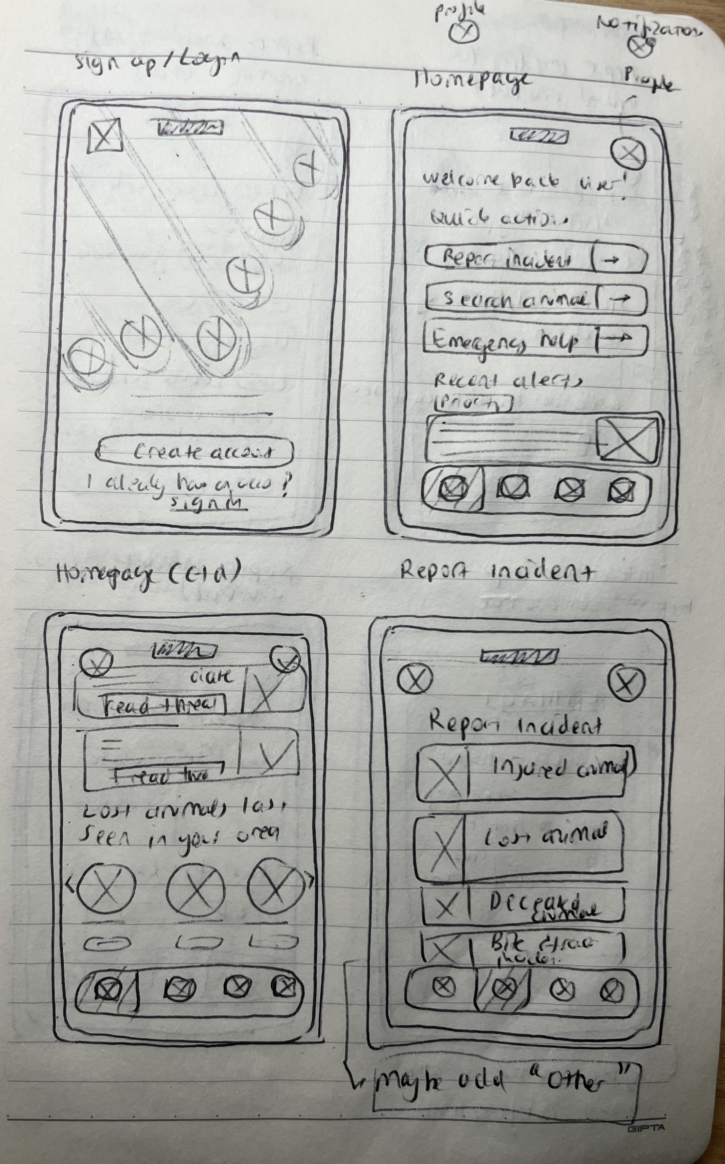
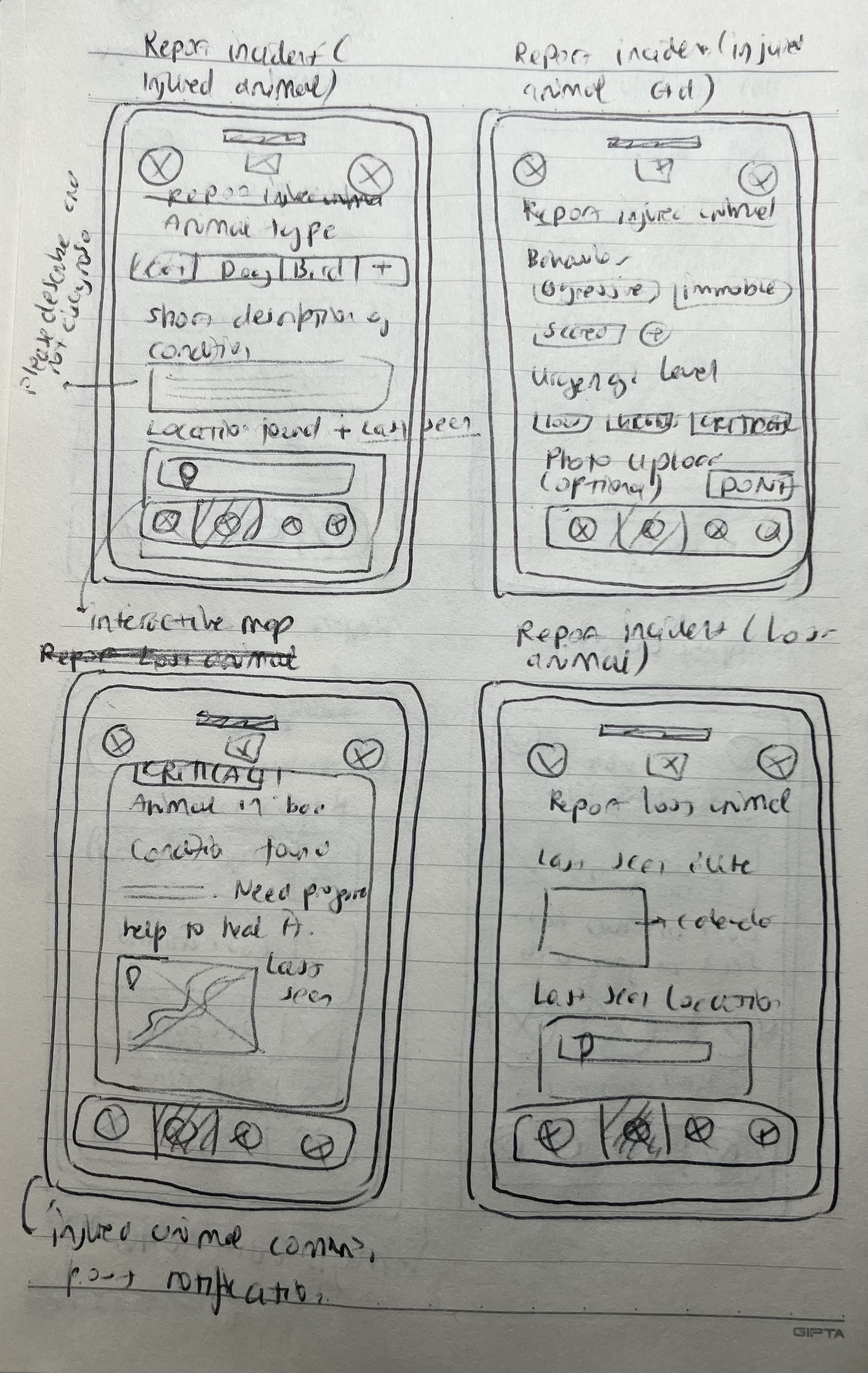
After empathizing with and understanding the potential users, I created a user flow and information architecture, along with quick paper wireframes that I later digitized in Figma.
Information Architecture
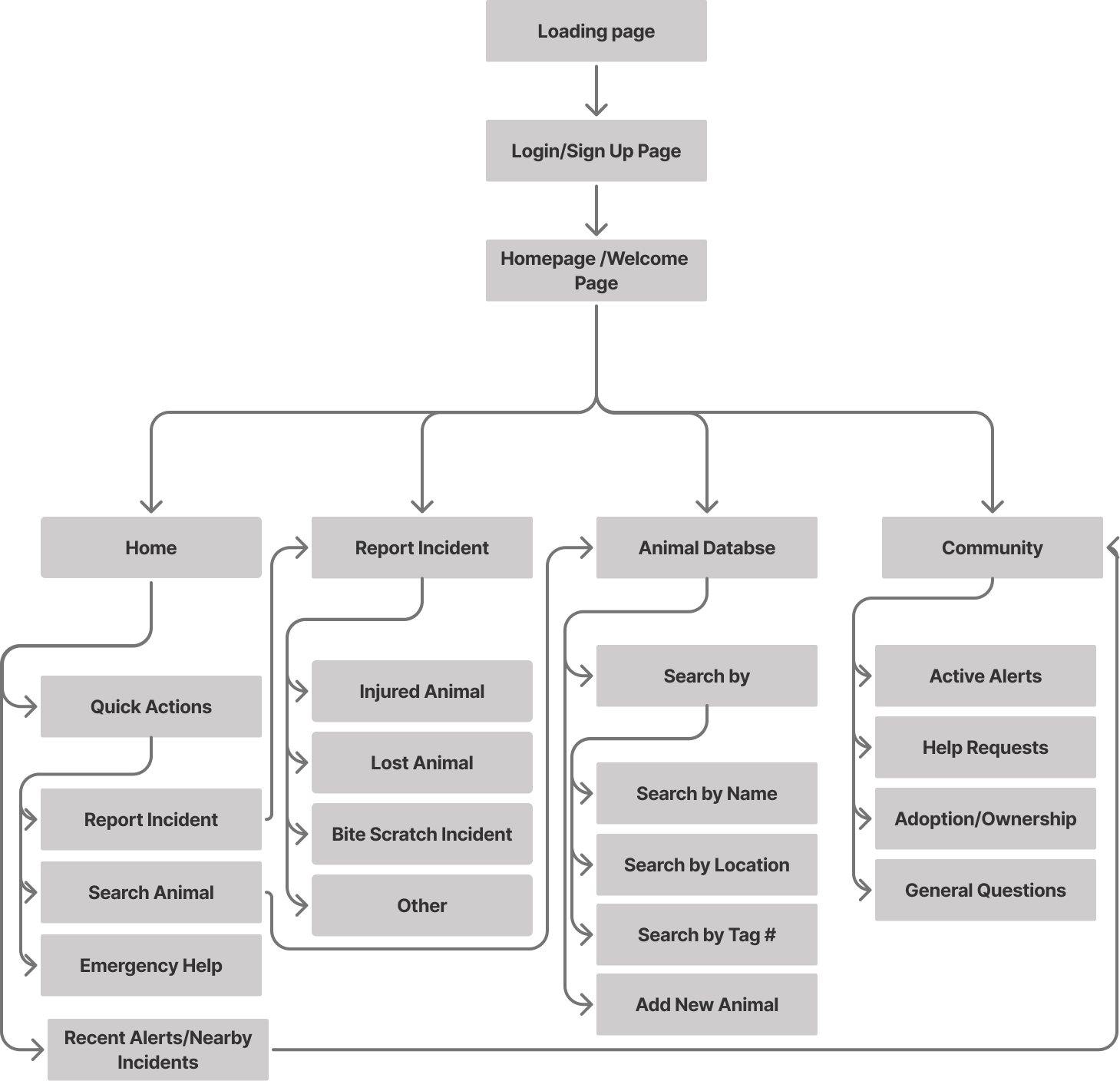
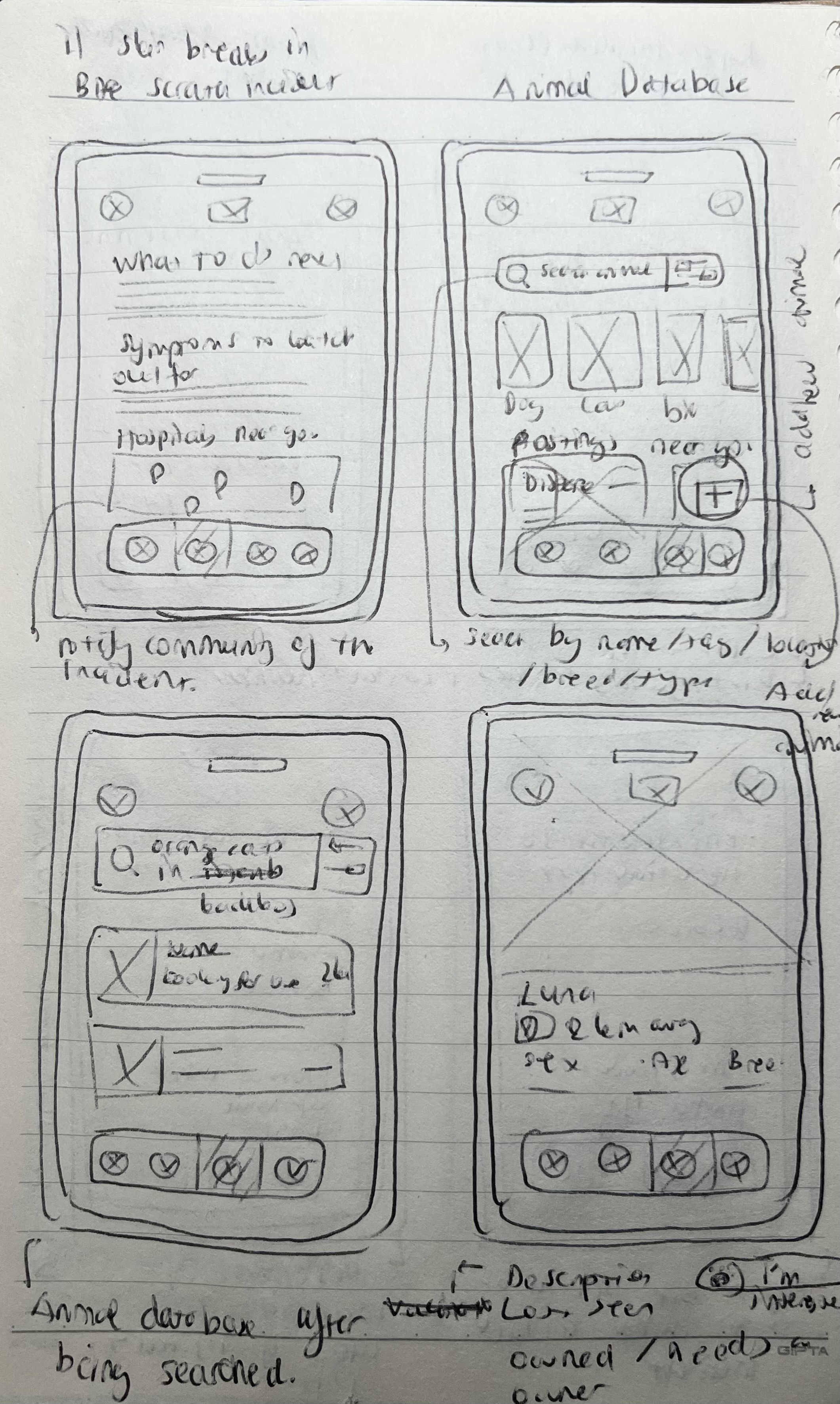
Low Fidelity Wireframes
User Testing
User testing was conducted through an unmoderated usability study in which participants were given a link to the prototype and asked to think out loud while completing key tasks, such as searching for items and navigating the app.
I synthesized the results using an affinity diagram, which helped identify several recurring patterns and insights:
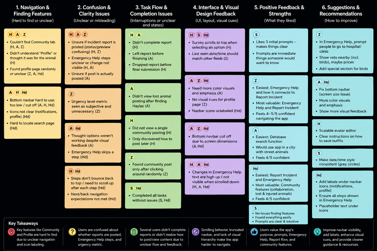
User Testing Insights
4 out of 5 participants attempted to create an incident report before accessing the Emergency Help feature during urgent scenarios. This means that the distinction between reporting an incident and receiving immediate guidance was not clear enough to users.
3 out of 5 participants were unsure whether their incident report had been successfully submitted, with some leaving the flow before completion. This means that the report confirmation and submission feedback lacked sufficient clarity and visibility.
3 out of 5 participants struggled to locate the Community and Profile pages and relied on trial-and-error navigation. This means that the navigation system lacked strong visual indicators and discoverability.
4 out of 5 participants experienced confusion due to scrolling behavior and content updates appearing outside the visible screen area. This means that important interaction feedback was not consistently visible to users during task flows.
5 out of 5 participants were able to successfully search for animals and access related animal information without difficulty. This means that the database organization and core browsing experience were intuitive and easy to navigate.
Reccomendations for Improvement
P1 — Improve Navigation Clarity & System Feedback
The highest priority improvements focus on reducing user confusion during critical flows and making navigation more intuitive. Clearer distinctions between Emergency Help and Report Incident should be introduced through improved labels, descriptions, and decision prompts. Report submission feedback should also be strengthened with clearer confirmation states and visible success messaging to ensure users understand when actions are completed. In addition, the bottom navigation should be made more visible and accessible across different screen sizes by adding icon labels, improving spacing, and increasing tap areas.
P2 — Improve Task Flow Visibility & Reporting Accuracy
Several usability issues were related to users missing important information during multi-step flows or struggling to accurately assess situations. Improving scrolling behavior, automatically repositioning users to visible content areas, and adding progress indicators would create clearer interaction feedback throughout tasks. Additionally, replacing subjective urgency metrics with more actionable questions about injuries or dangerous behavior would help users provide more reliable incident reports.
P3 — Enhance Visual Communication & Contextual Support
Lower priority improvements focus on refining the overall user experience through stronger visual hierarchy, clearer interaction states, and improved feature discoverability. Enhancing contrast, color emphasis, and form feedback would make the interface easier to navigate, while onboarding cues and clearer iconography could improve awareness of Community and Profile features. Participants also expressed interest in contextual support tools, such as nearby hospitals and veterinarians, which could further strengthen the app’s usefulness during emergency situations.
Final Designs
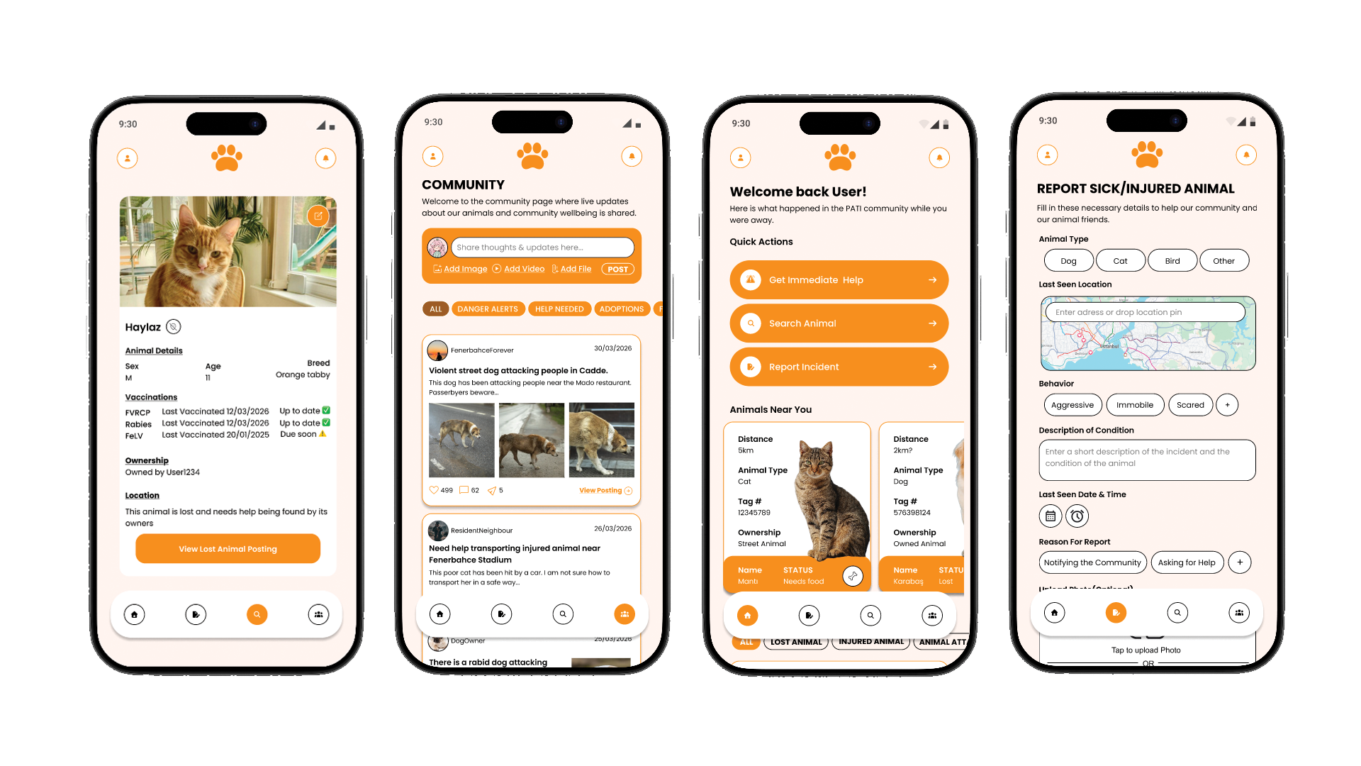
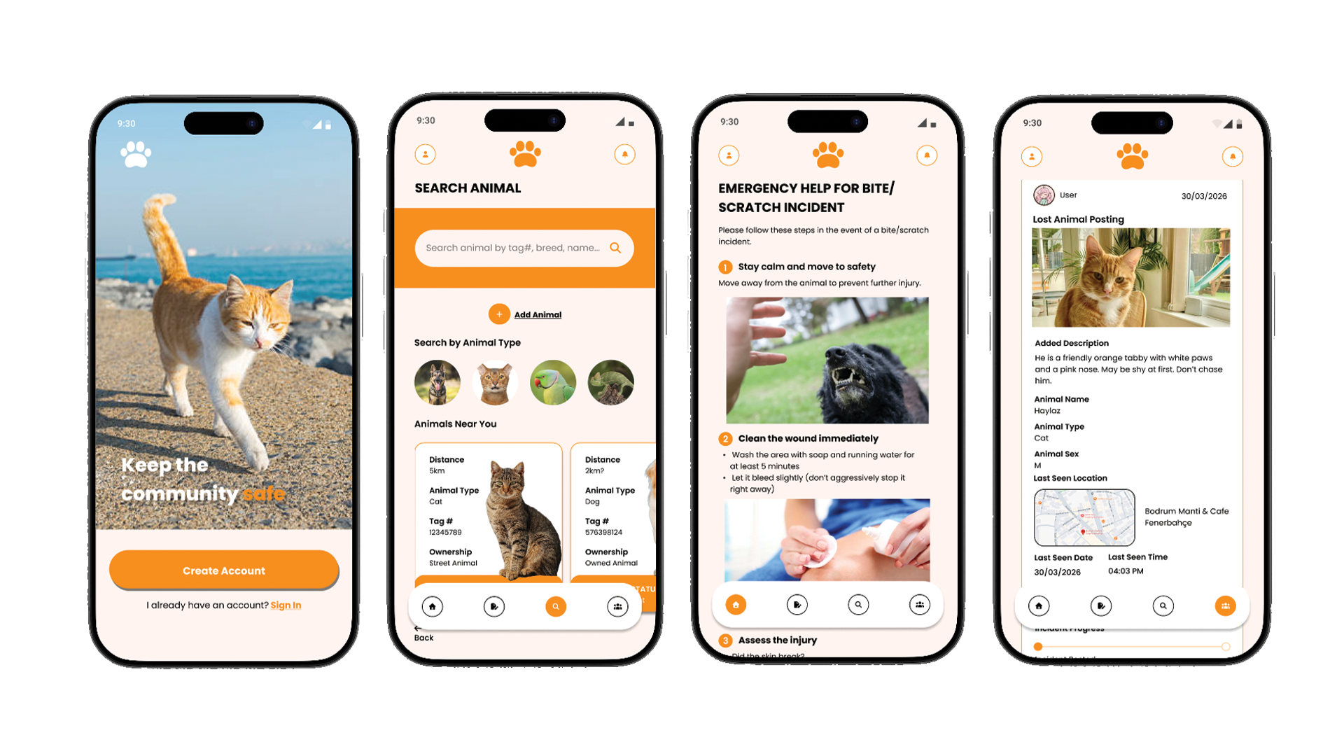
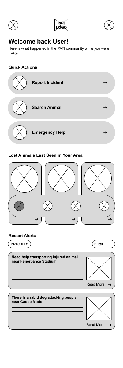
Getting emergency help and reporting incident in the case of an animal attack
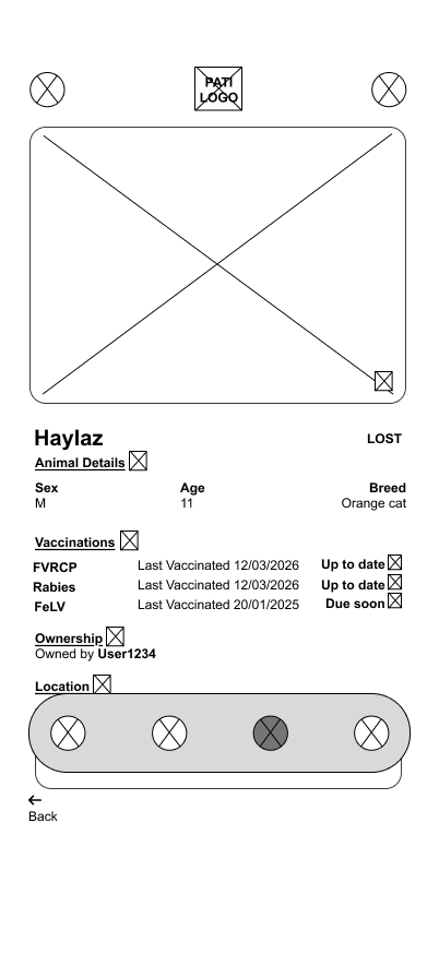
Searching an animal in the community updated animal database
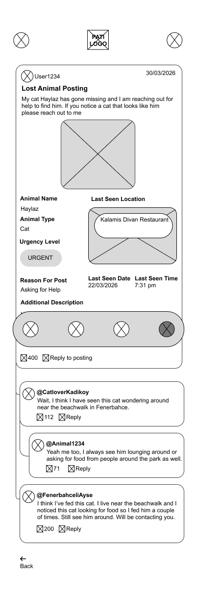
Looking at community posts, profile and notifications from other users
Conclusion
Challenges and Constraints
One of the main challenges in this project was designing for users in stressful situations, such as after an animal attack or while helping an injured street animal. This required balancing urgency with clear and accessible navigation.
Another challenge was designing a community-driven animal database. Since different users may identify the same street animal using different names or descriptions, maintaining consistency and avoiding duplicate records became an important consideration.
Usability testing also revealed issues with navigation clarity and report completion. Some users struggled to locate sections such as the community tab or profile page, while others were unsure whether their reports had been successfully submitted due to unclear feedback and status indicators.
Responsive design was another constraint. On certain devices, the bottom navigation bar appeared partially cut off or difficult to interact with, highlighting the importance of accessible touch targets and adaptable layouts.
The project also required careful consideration around emergency-related information. Testing showed that asking users to assess the urgency level of an incident felt too subjective, leading to a shift toward more objective prompts focused on injuries and symptoms instead.
Outcomes
Despite these challenges, the final prototype successfully addressed many of the core user needs identified during research and testing. Users were generally able to:
Access emergency guidance for animal-related incidents
Create and submit community reports
Search for animals through the database
View animal profiles connected to community postings
Engage with community-driven content and updates
Testing also showed that users valued the connection between Emergency Help and Report Incident, as well as the community-focused features that encouraged collaboration and awareness around street animals.
Future improvements would focus on improving navigation discoverability, clarifying report submission states, enhancing visual feedback, and expanding resources such as nearby veterinary information and better animal identification systems.
What I Learned
Through Pati, I strengthened my ability to design for high-stress and emotionally sensitive situations where clarity and usability are especially important.
This project also improved my usability testing and research synthesis skills by helping me translate user frustrations and behavioral patterns into actionable design improvements.
Additionally, the project deepened my understanding of designing community-centered systems that rely on collaborative participation, evolving user-generated content, and long-term scalability.