Research
I conducted user interviews with five participants to understand the common challenges people face when trying to locate grocery items in local or unfamiliar stores.
Personas
Based on the user interviews I conducted, I synthesized the data to create three personas that represent the target audience for the product.
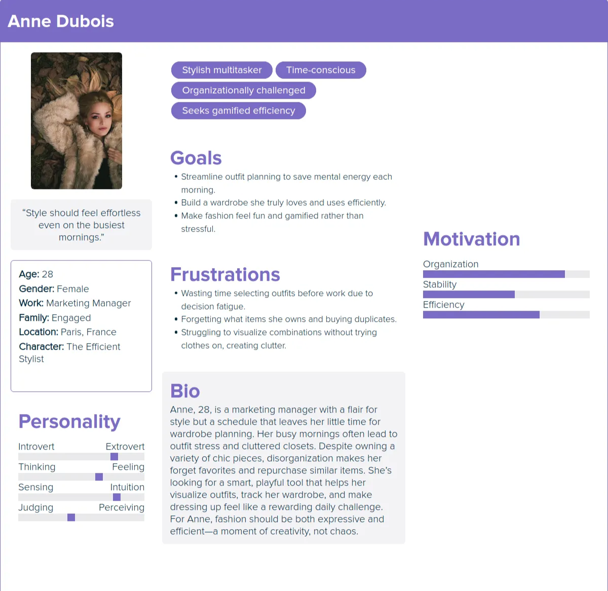
Anne's User Story
As someone with a large wardrobe, I want to catalog what I own so I can avoid buying duplicates and remember my options.
As a busy working professional, I want outfit suggestions based on items I already have so I can get dressed faster with less mental effort.
As someone who forgets which outfits worked, I want to save past looks so I can reuse proven combinations for future events.
As someone who struggles to visualize outfits, I want a “pairing” feature that shows items together so I can decide without making a mess.
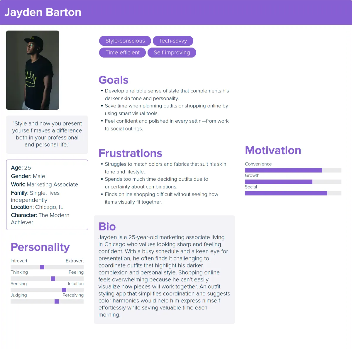
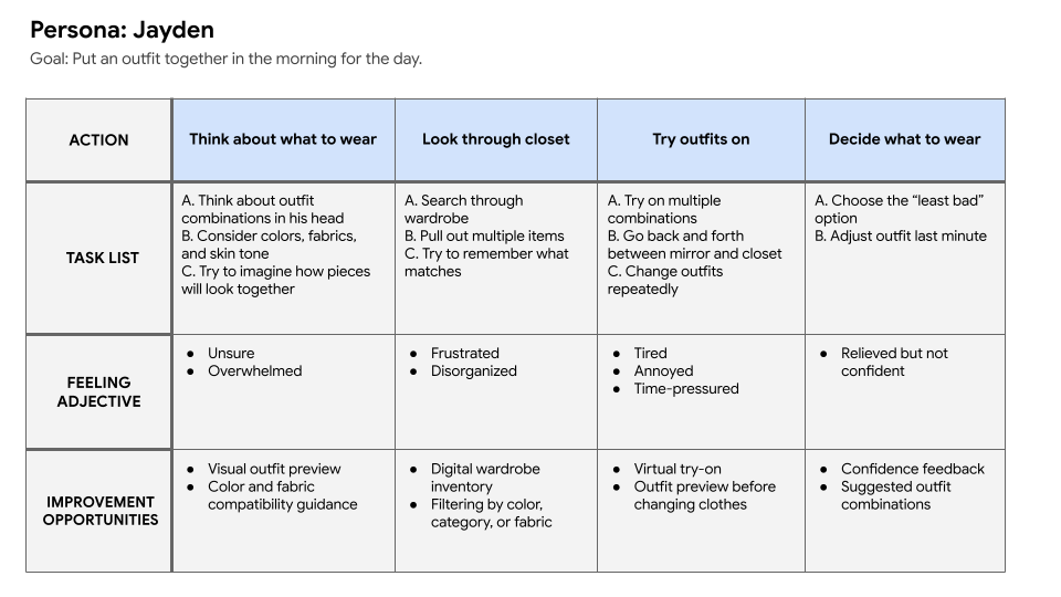
Jayden's User Story
As a style-focused professional with a darker skin tone, I want to preview color combinations on a model with similar skin tone so I can choose outfits that flatter me.
As someone who struggles with fabric compatibility, I want guidance on which textures and materials pair well together so my outfits look cohesive.
As a busy shopper, I want to quickly test outfit combinations digitally so I do not waste time trying multiple looks in front of a mirror.
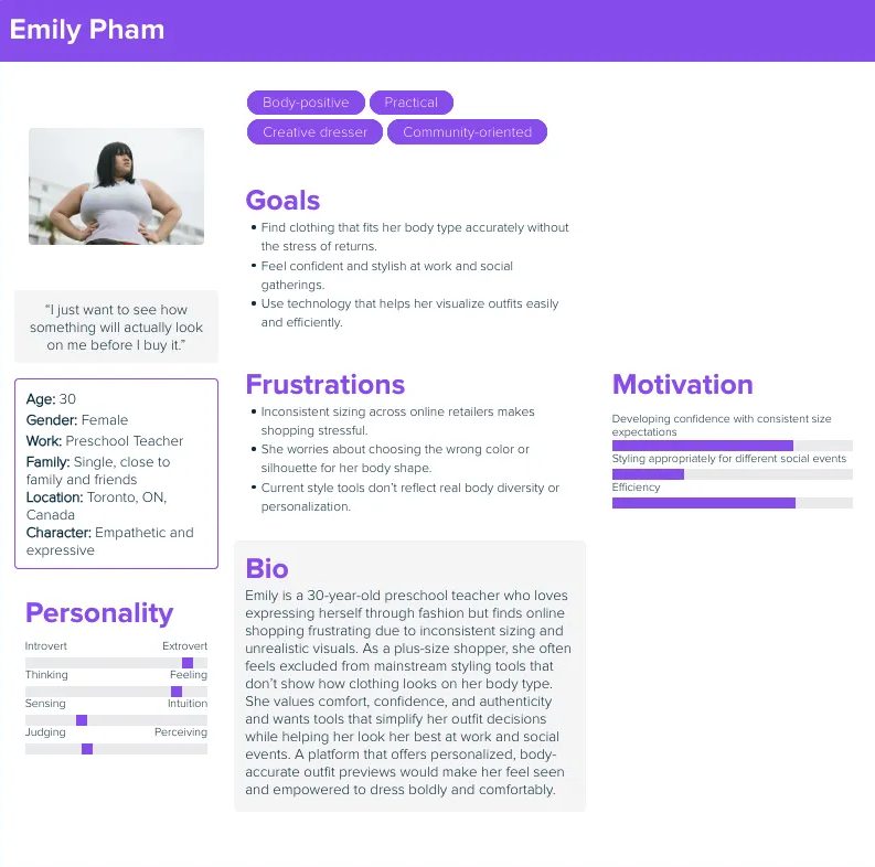
Emily's User Story
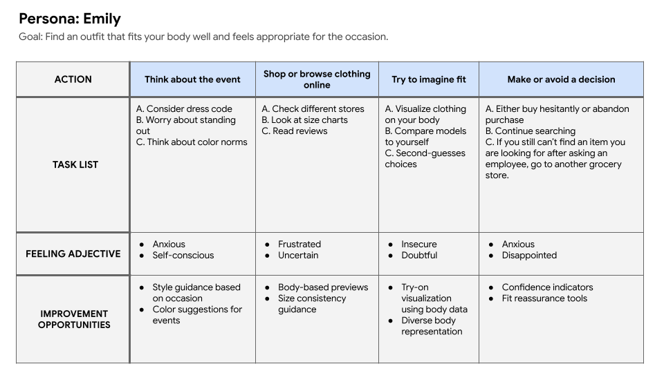
As a plus-sized shopper, I want to see how clothes look on a body similar to mine so I can shop online with confidence.
As someone who has inconsistent sizing across brands, I want personalized size recommendations based on my measurements so I can avoid returns.
As someone who worries about standing out at events, I want outfit guidance based on the occasion so I can feel appropriate and confident.
As someone who prefers to blend in with style norms at work events, I want color and style suggestions that match common dress expectations so I can feel comfortable.
User Journey Maps
I created user journey maps to understand the actions and feelings of the users going through challenges to better understand how to solve their problems.
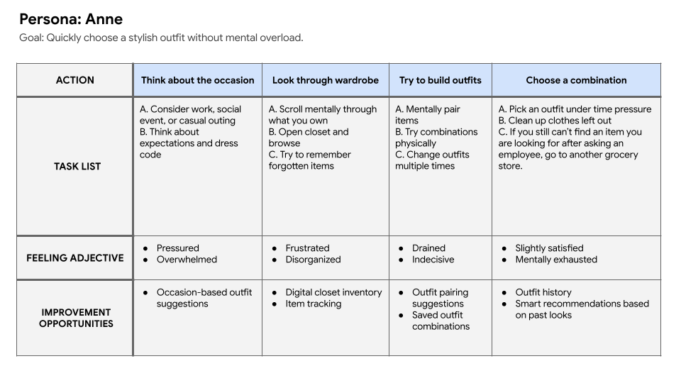
From the user journey maps I was able to extrapolate problem statements and hypothesis statements for both of the potential users.
Problem Statements
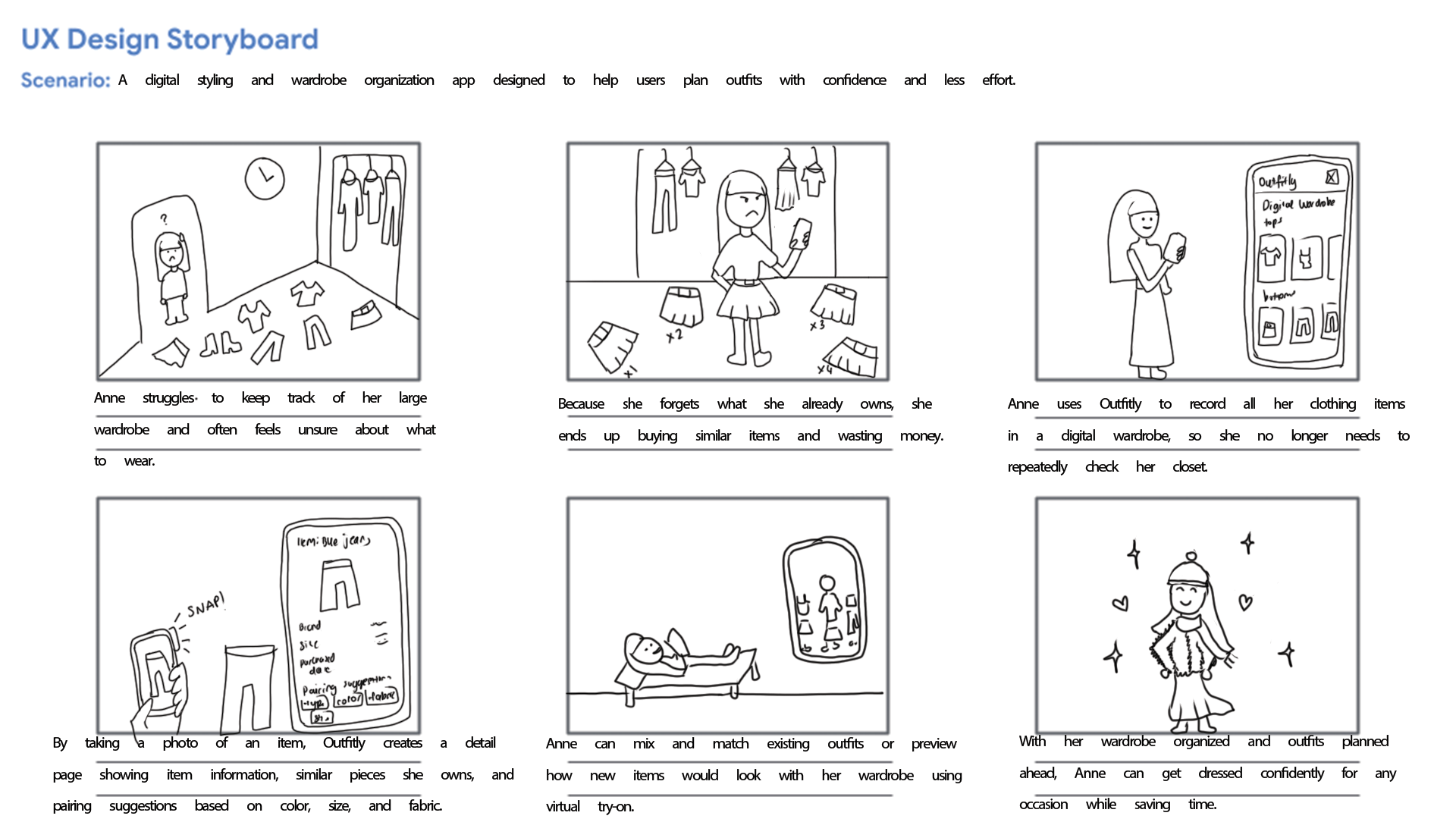
Anne enjoys fashion but struggles to keep track of her wardrobe and visualize outfit combinations due to poor organization and limited time, often leading to repetitive purchases and unnecessary effort.
Jayden wants to put together outfits that look cohesive and suit his skin tone, but he struggles to judge color and fabric compatibility without physically trying items on. This makes outfit planning time-consuming and frustrating.
Emily finds online shopping difficult because clothing sizes vary across brands, and she cannot easily tell how items will look on her body type. She also feels pressure to meet social and workplace style expectations without standing out in the wrong way.
Hypothesis Statements
If we help Anne digitally organize her wardrobe and generate outfit combinations using items she already owns, then she will reduce decision fatigue, save time, and feel more confident planning outfits.
If we provide a tool that visually previews how clothing items work together and accounts for skin tone and fabric compatibility, then Jayden will be able to choose outfits more confidently and spend less time second-guessing his choices.
If we allow Emily to preview clothing on a body model that reflects her size and shape, and offer styling guidance for different occasions, then she will feel more confident shopping online and choosing outfits that fit both her body and social context.
Storyboards
From the problem statements created I was able to create a big picture and close-up storyboards to empathize with and the user and their pain points.
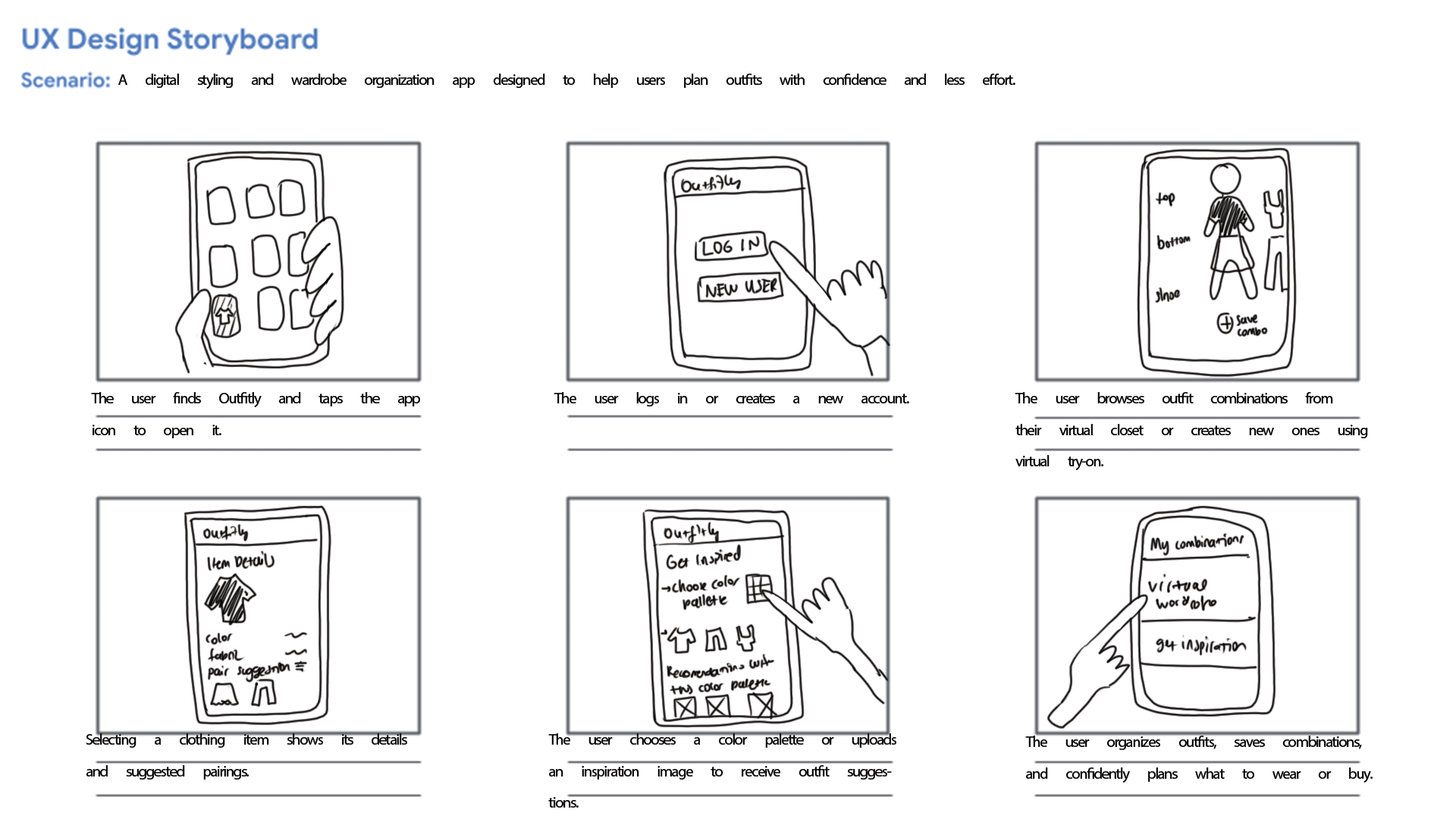
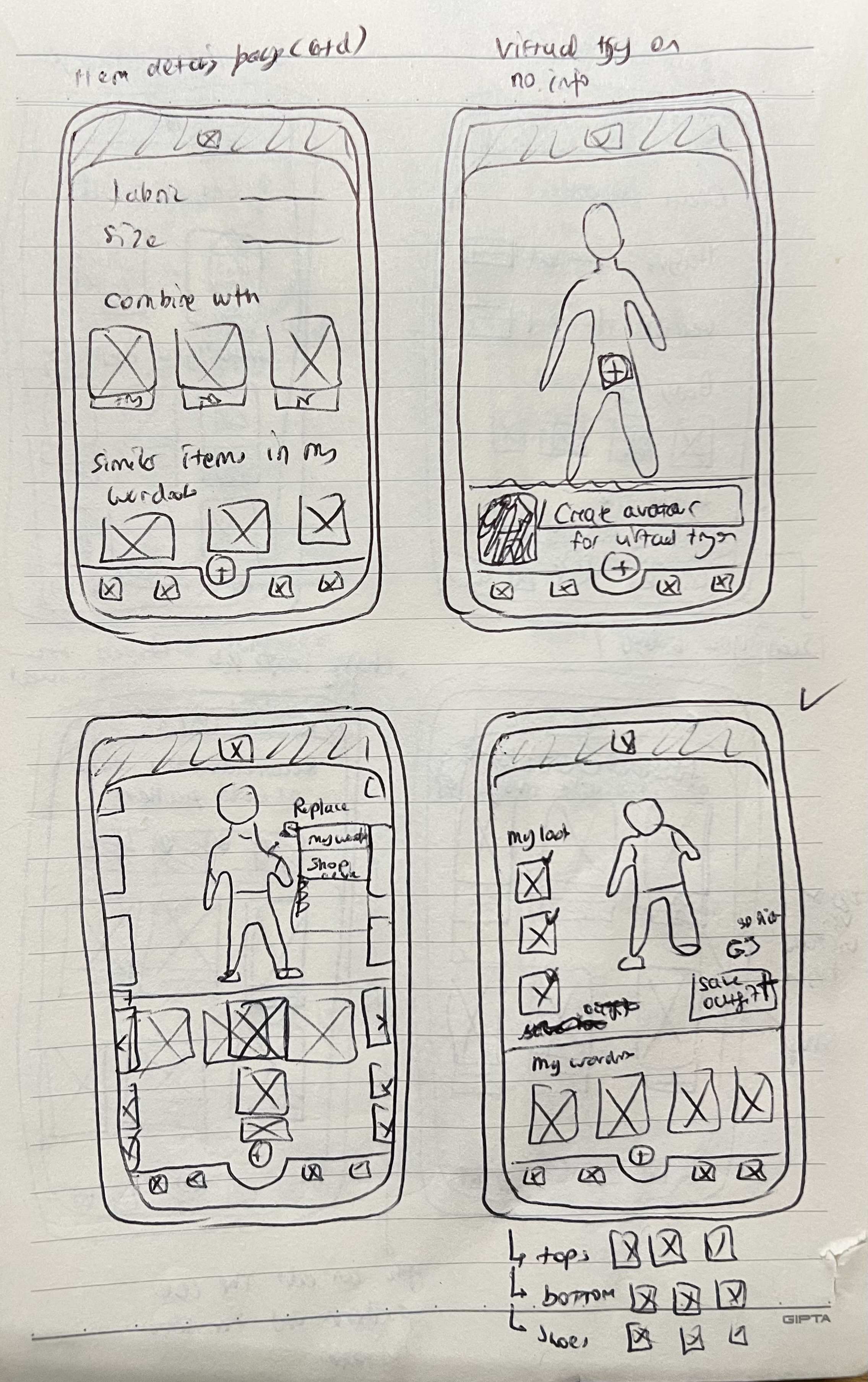
Initial Designs
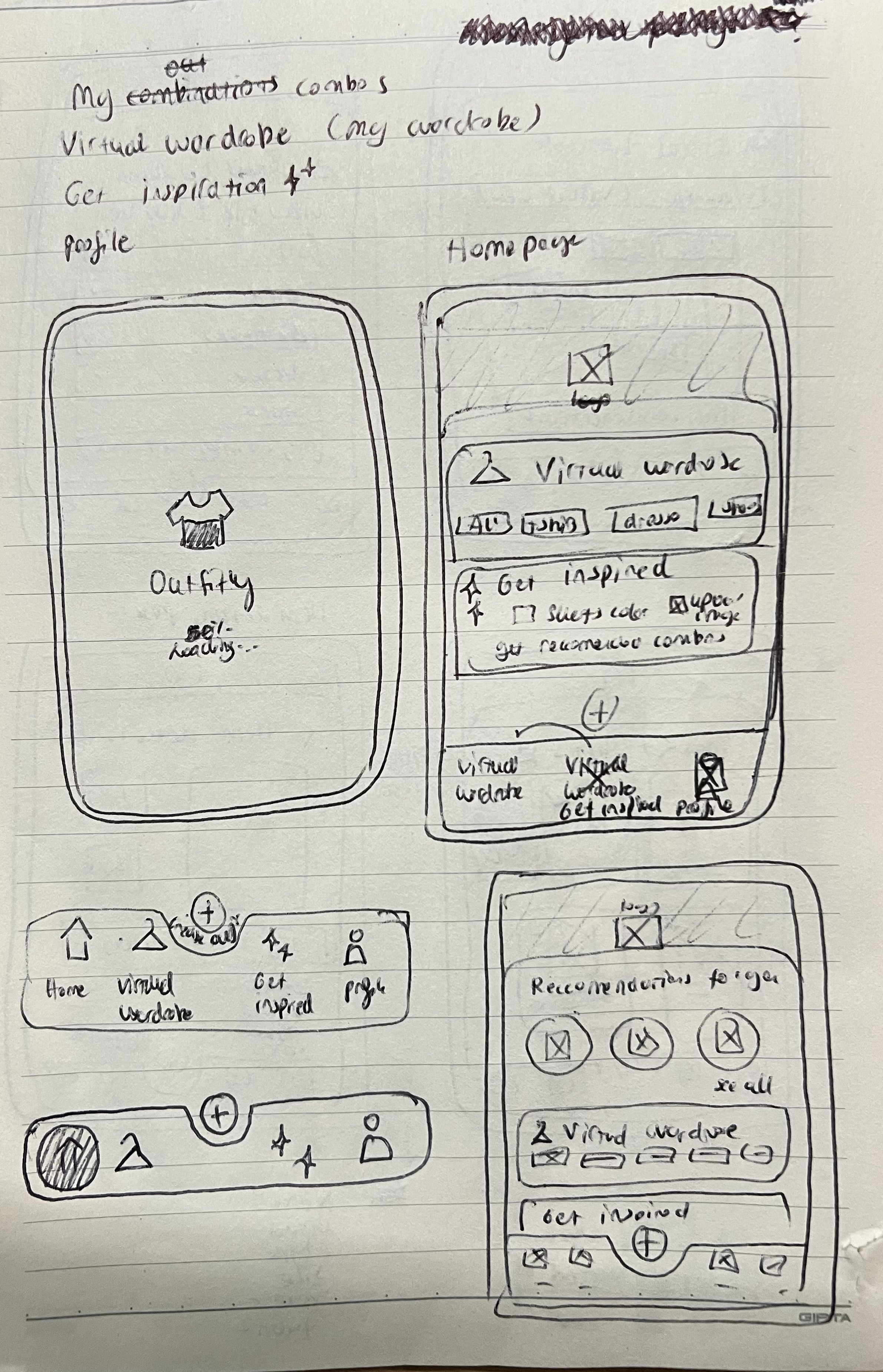
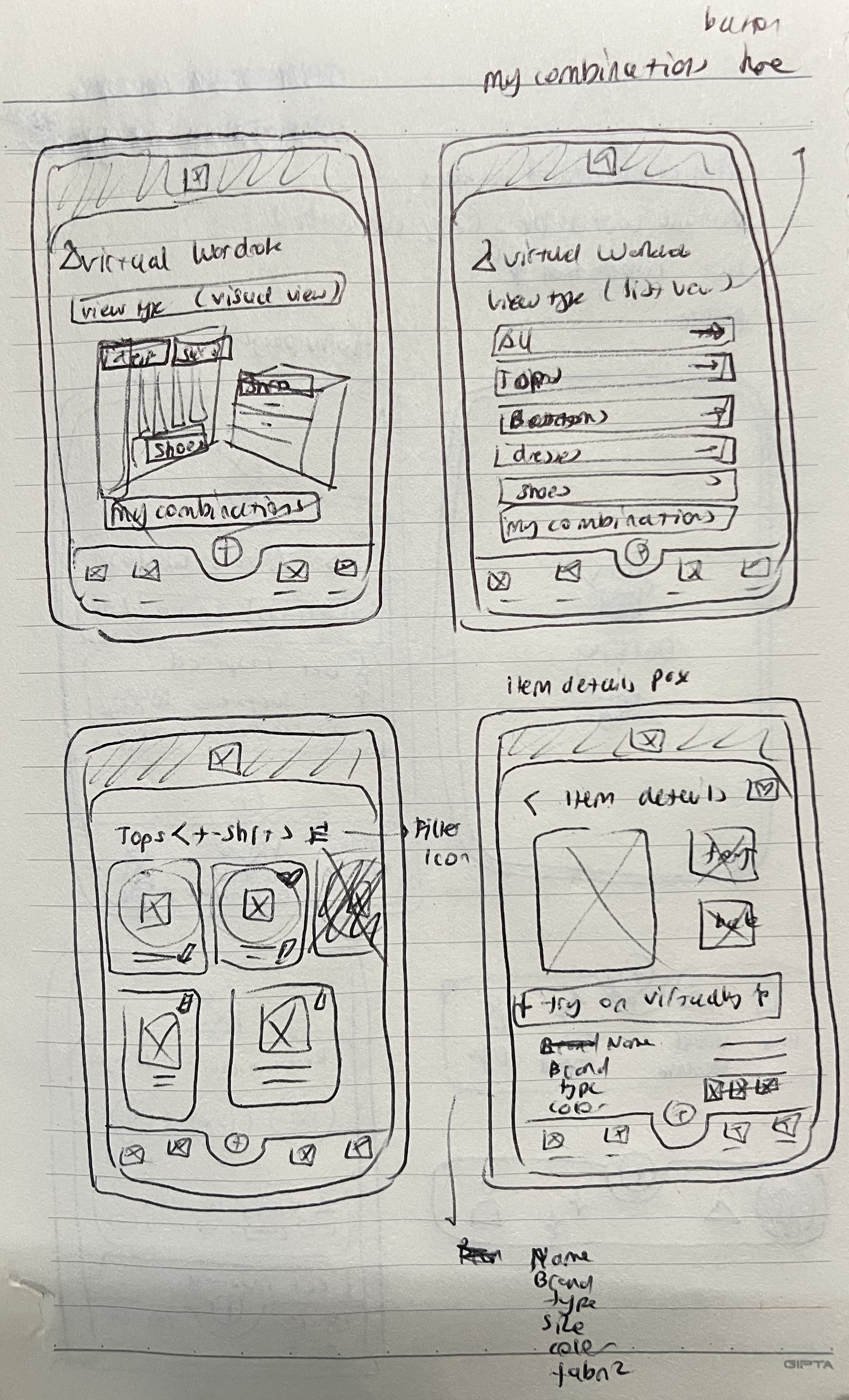
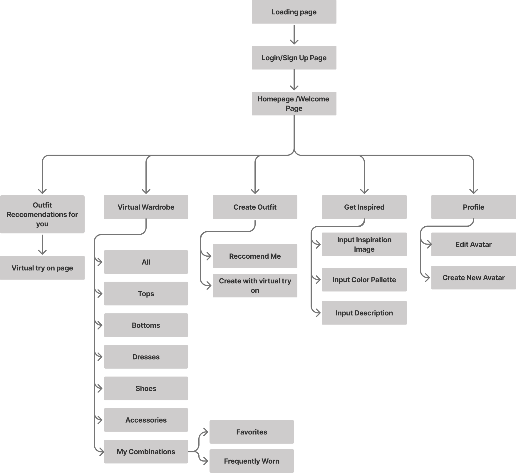
After empathizing with and understanding the potential users, I created a user flow and information architecture, along with quick paper wireframes that I later digitized in Figma.
Information Architecture
Low Fidelity Wireframes
User Testing
User testing was conducted through an unmoderated usability study in which participants were given a link to the prototype and asked to think out loud while completing key tasks, such as searching for items and navigating the app.
I synthesized the results using an affinity diagram, which helped identify several recurring patterns and insights:
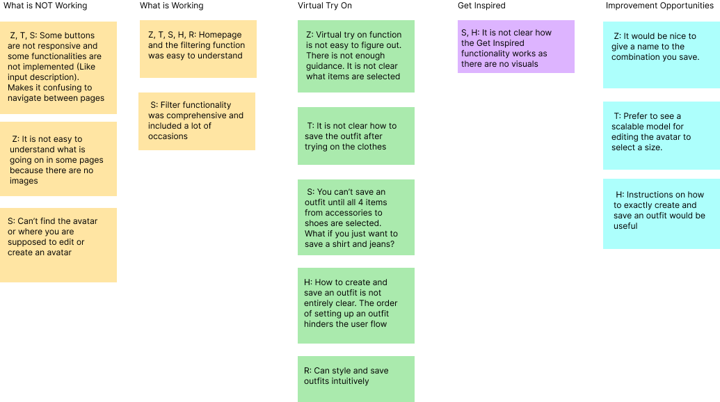
User Testing Insights
5 out of 5 participants found the homepage layout and filtering function intuitive and time-saving. This indicates that the core navigation and filtering experience is effective and does not require major changes.
4 out of 5 participants found the Virtual Try-On page and the process of creating and saving outfits confusing. This suggests that users need clearer guidance, improved visual hierarchy, and a more structured saving flow.
3 out of 5 participants were unsure how the Get Inspired page functioned due to limited visual cues. This indicates that the feature lacks clarity and requires stronger visual direction and instructional support.
2 out of 5 participants struggled to locate the button for creating an outfit. This suggests that the call to action lacks prominence and requires clearer labeling.
2 out of 5 participants could not find where to create or edit their avatar. This indicates that the avatar feature needs improved visibility and clearer entry points.
Reccomendations for Improvement
P1 — Improve Feature Discoverability (Highest priority)
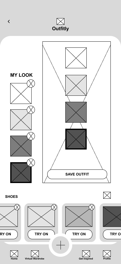
The highest priority is improving the Virtual Try On experience, as 4 out of 5 participants found the process of creating and saving outfits confusing. The flow should be restructured to feel more guided and sequential, with clearer visual hierarchy and a prominent “Save Outfit” call to action. Adding subtle instructional text and stronger visual feedback after an outfit is saved would reduce uncertainty and make the feature feel more intuitive and complete.
P2 — Improve Feature Discoverability
A secondary priority is improving the visibility of key features, including the “Create Outfit” button and avatar editing functionality. Several participants struggled to locate these entry points, which suggests that important actions are not visually emphasized enough. Strengthening visual hierarchy, refining labeling, and introducing light onboarding cues would make these features easier to find and reduce cognitive load for new users.
P3 — Strengthen Visual Guidance on the Get Inspired Page
Finally, the Get Inspired page would benefit from stronger visual guidance. Participants expressed confusion due to limited visual content, indicating that the purpose of the feature was not immediately clear. Adding example outfit combinations, mood board previews, and brief contextual instructions would help users understand how to use the feature and increase engagement.
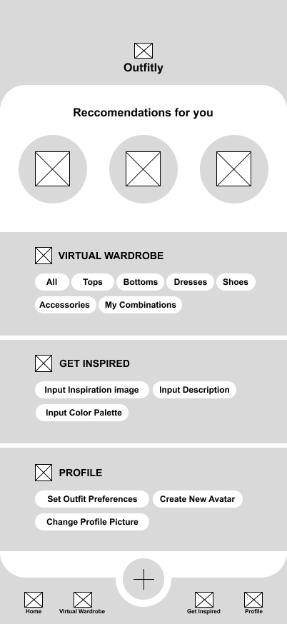
Final Designs
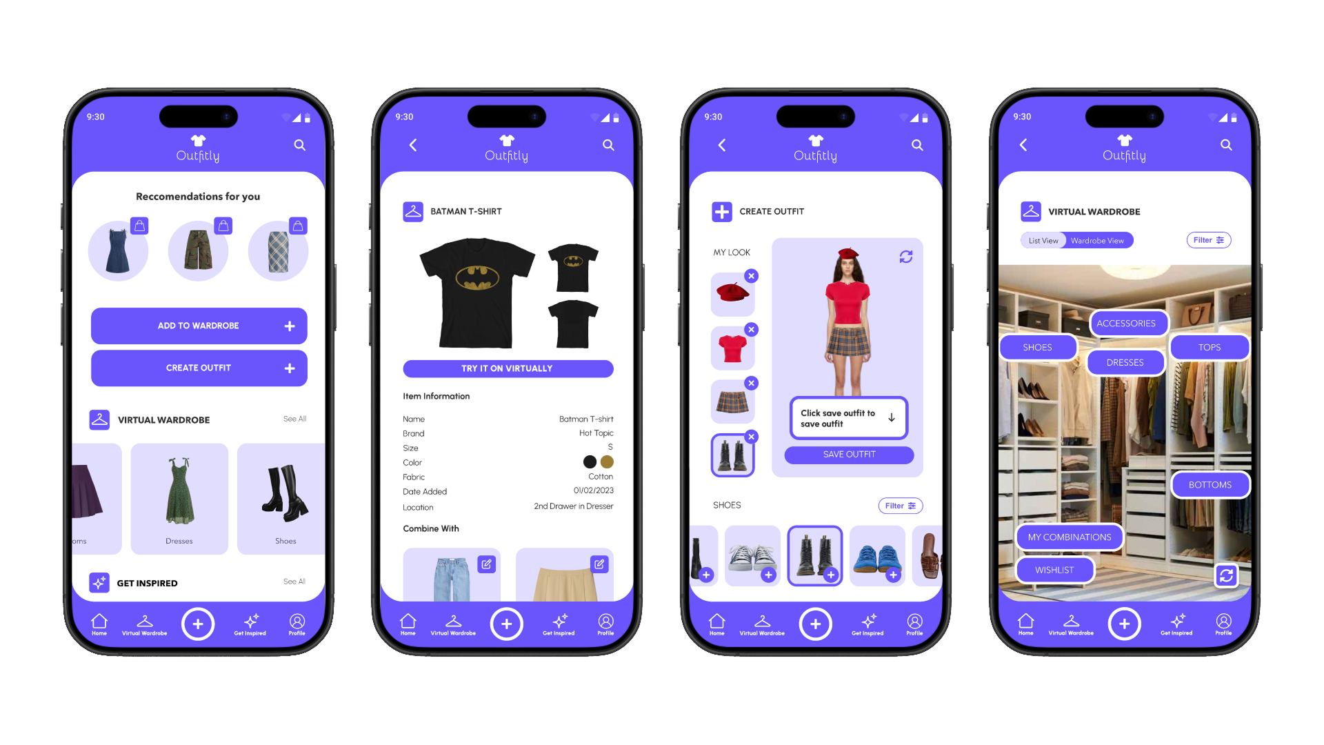
.png)
Creating and Saving an Outfit
Filtering Clothes by Fabric
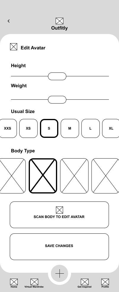
Creating an Avatar for your Specific body shape & type
Conclusion
Challenges and Constraints
One of the main challenges in this project was sourcing outfit images that worked well together. Many images had inconsistent proportions and backgrounds, which required extensive resizing and background removal to create cohesive outfit combinations.
Usability testing also presented challenges. Since the app is highly visual, testing with a low-fidelity prototype made it difficult for users to fully understand the experience. Additionally, the instructions for the unmoderated usability study were not clear enough, which affected the quality of feedback.
Another challenge was defining the visual style of the app. I wanted to move away from typical minimalist designs and introduce a more creative and expressive aesthetic. However, I was mindful of maintaining a gender-neutral and inclusive feel. I selected a purple tone that adds personality without clashing with outfit colors.
Designing the avatar feature was also complex. Research showed that asking users for inputs like height and weight could feel uncomfortable and restrictive. Instead, I allowed users to select a body type they identify with and adjust proportions such as shoulders, waist, and hips manually, creating a more flexible and inclusive experience.
Outcomes
Despite these challenges, the final prototype successfully addresses the core user needs identified during research. In high-fidelity usability testing, users were able to:
Create and save outfit combinations using both owned and unowned items
Filter wardrobe items by attributes such as color, fabric, and type
Navigate their wardrobe more easily using the visual wardrobe view
Create and customize an avatar that reflects their body through scanning and manual adjustments
Next steps include conducting broader usability testing with a more diverse group of users to validate findings at scale. Future iterations will focus on simplifying the outfit creation flow to reduce decision fatigue and make the experience feel less overwhelming. Improvements will also be made to filtering interactions by introducing more detailed attributes and specifications. Additionally, the avatar feature can be further enhanced with expanded customization options to improve accuracy and personalization.
What I learned
Through Outfitly, I strengthened my ability to translate user research into meaningful design decisions. I gained a deeper understanding of how different users approach outfit planning and designed solutions that support a range of needs and preferences.
This project also helped me improve my prototyping skills, especially in designing interactive and visually driven experiences. Iterative testing directly informed improvements to key features such as creating outfits, exploring inspiration, and avatar customization, resulting in a more intuitive overall experience.