Role
UX Researcher, UX DesignerDescription
As a part of the Google UX Design Certificate, I designed an app and a responsive website for a local grocery store that helps shoppers locate products as they shop in person.Duration
3 months


I conducted user interviews with five participants to understand the common challenges people face when trying to locate grocery items in local or unfamiliar stores.
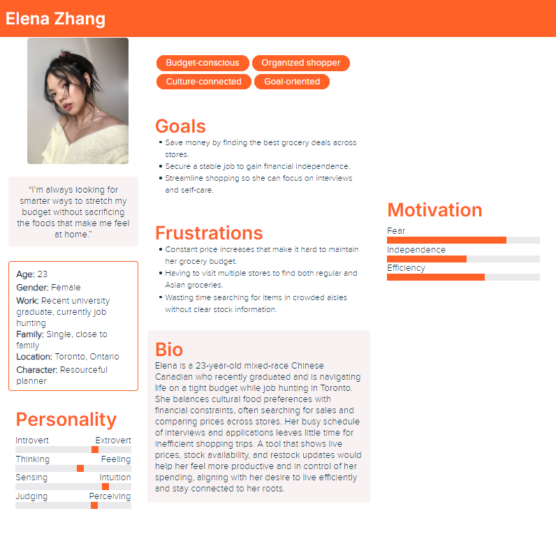
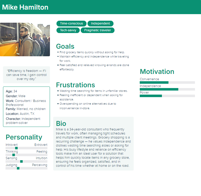
Based on the user interviews I conducted, I synthesized the data to create two personas that represent the target audience for the product.
I created user journey maps to understand the actions and feelings of the users going through challenges to better understand how to solve their problems.
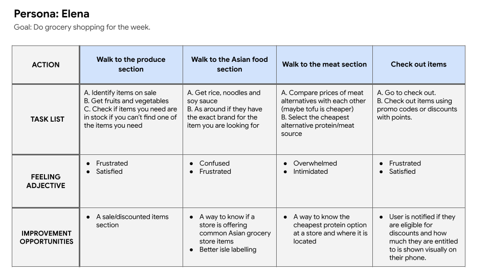
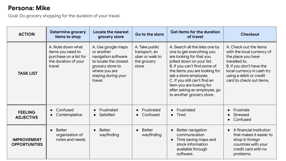
From the user journey maps I was able to extrapolate problem statements and hypothesis statements for both of the potential users.
Elena is a busy recent graduate on a tight budget who needs a grocery item locator app because she she needs to save time and money.
Mike is a working professional that travels often for work who needs a grocery item locator app because he needs to save time and mental energy grocery shopping in places he is unfamiliar with.
If Elena downloads the grocery item locator app, then she can utilize the filter options to clearly see where the discounted and on sale items are as well as asian grocery store items.
If Mike downloads the grocery store app, then they will be able to find grocery items they are looking for with ease and won't feel pressured to speak to employees about where to find the items.
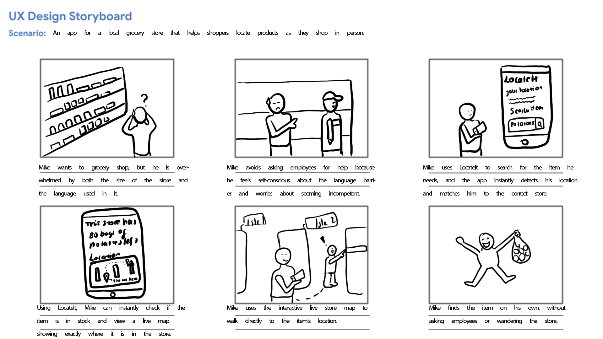
From the problem statements created I was able to create a big picture and close-up storyboards to empathize with and the user and their pain points.
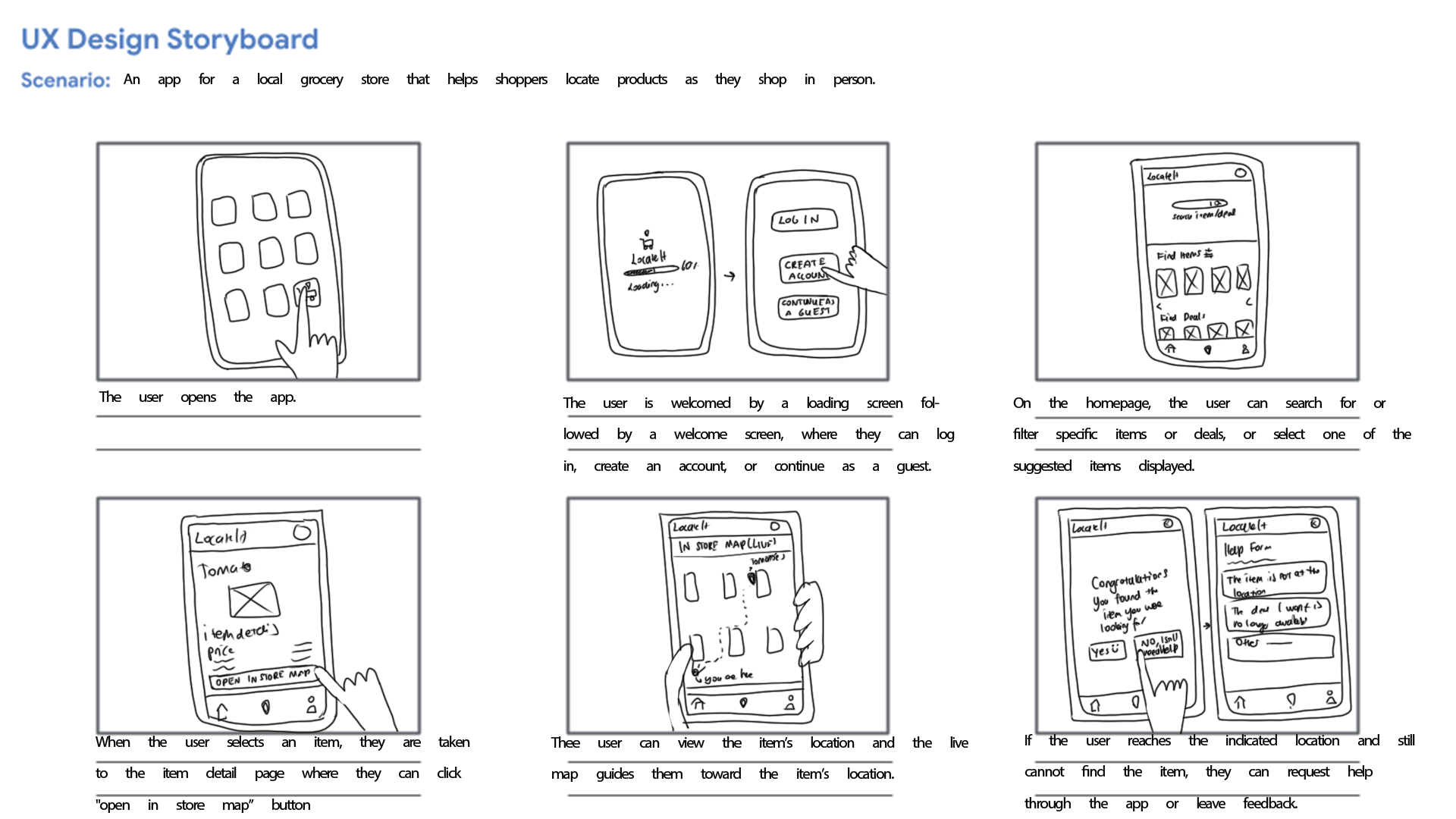
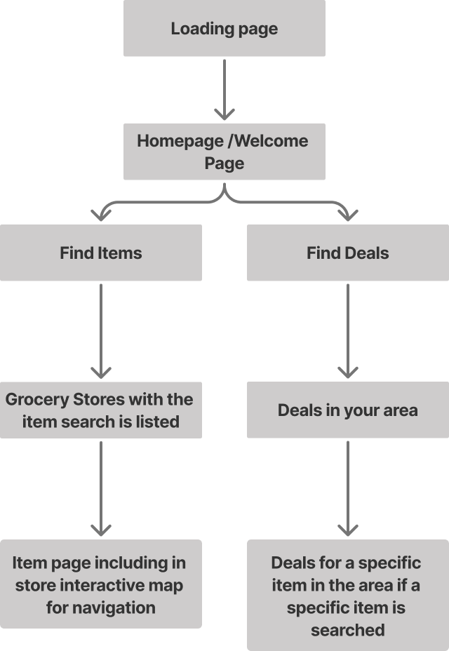
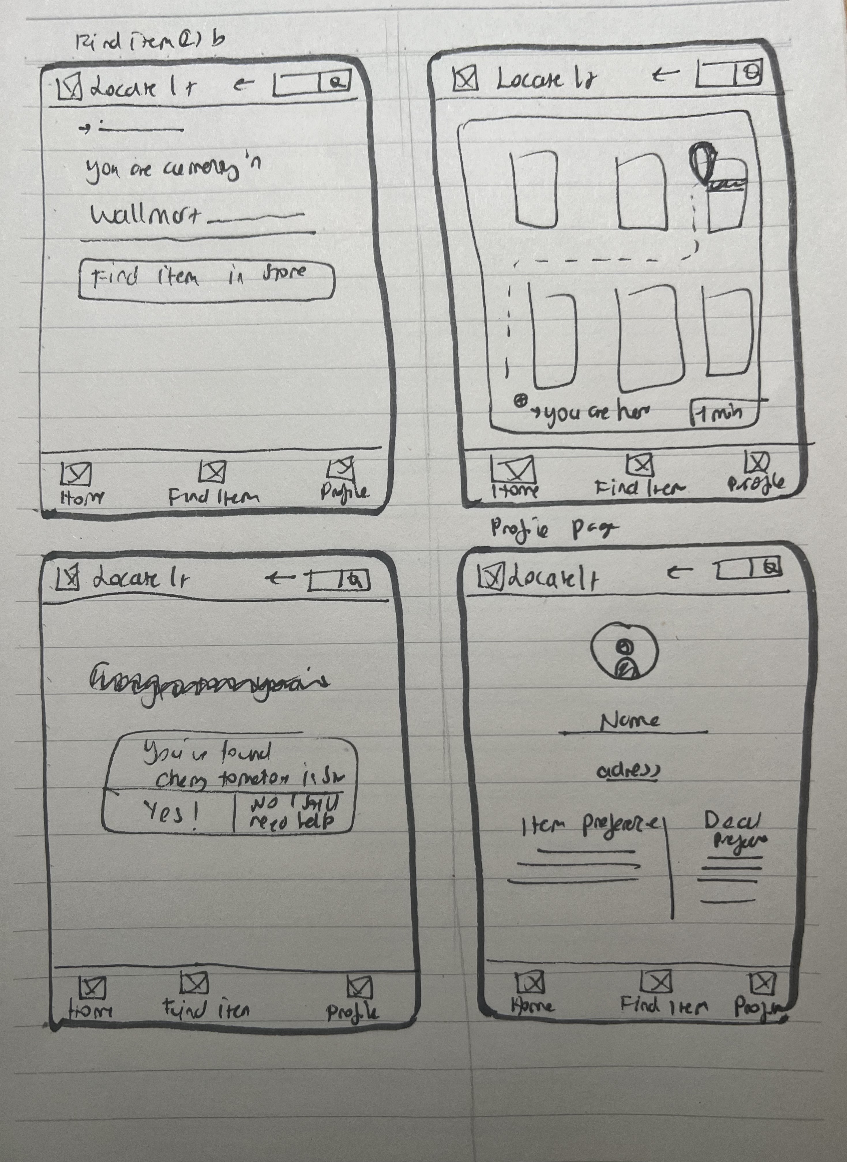
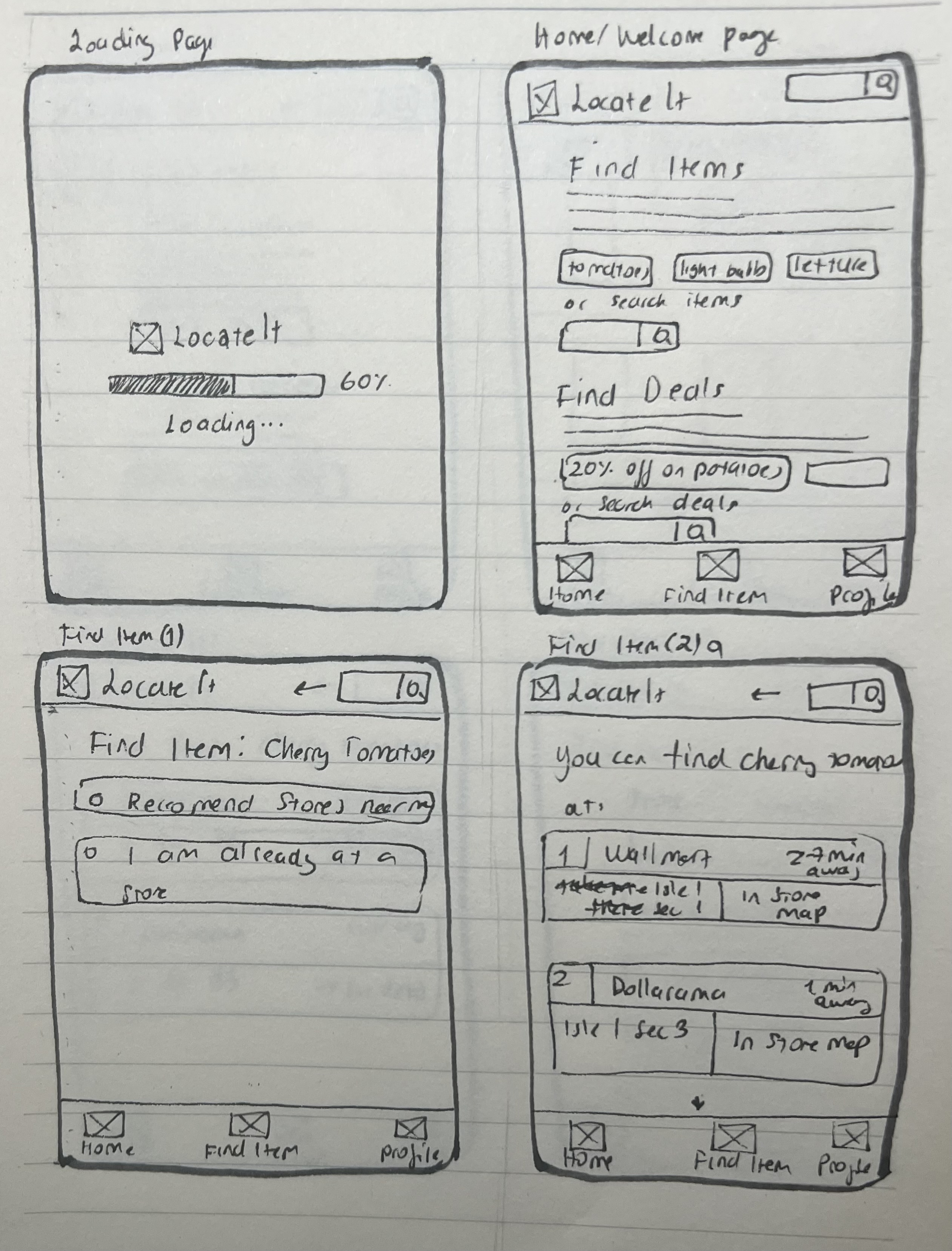
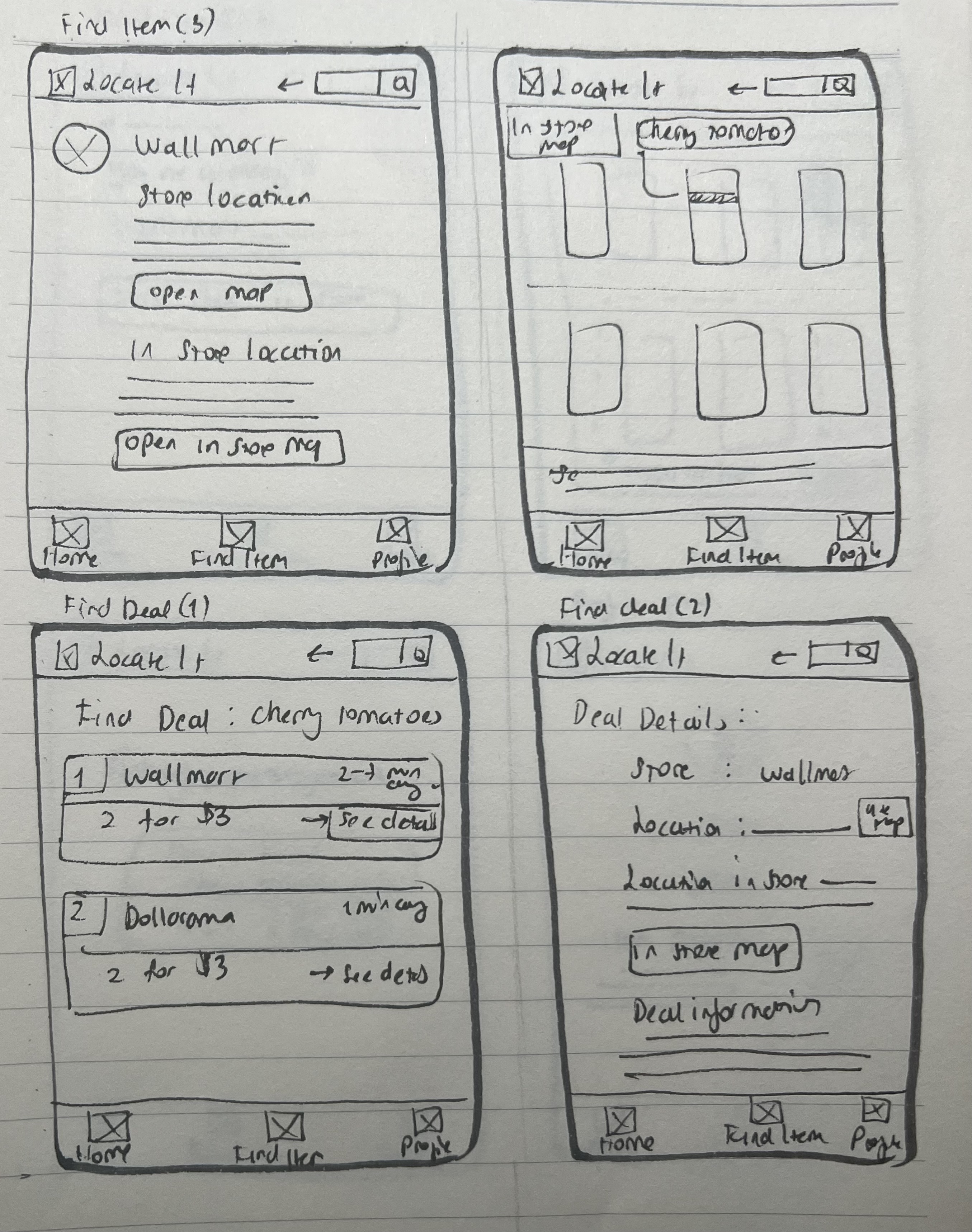
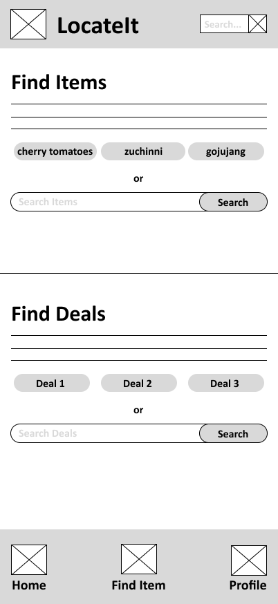
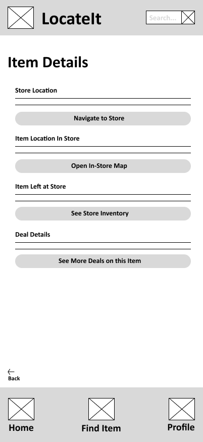
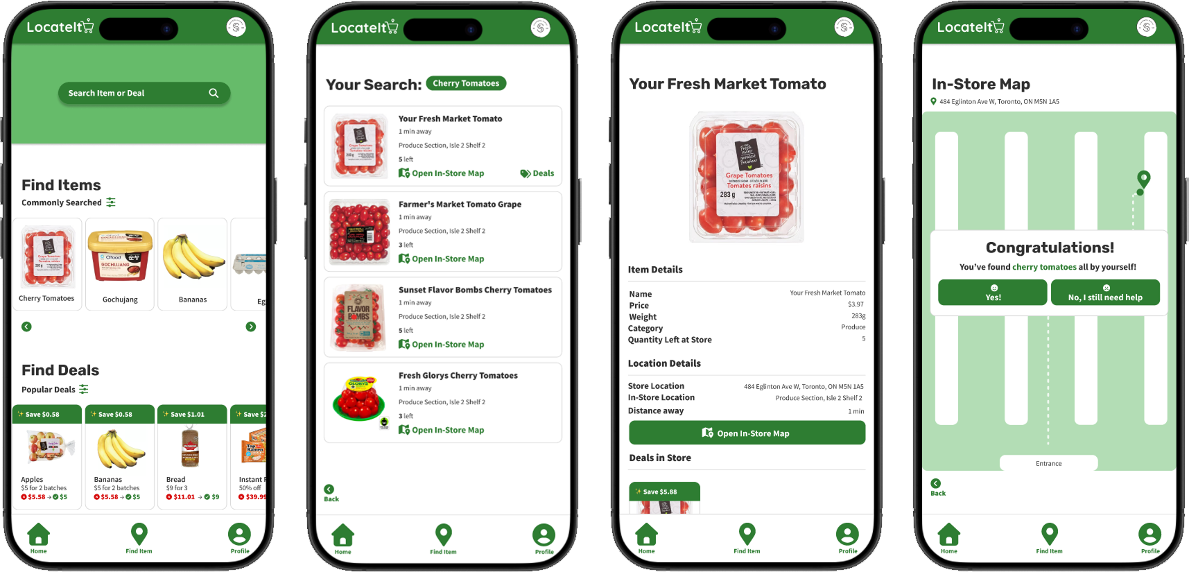
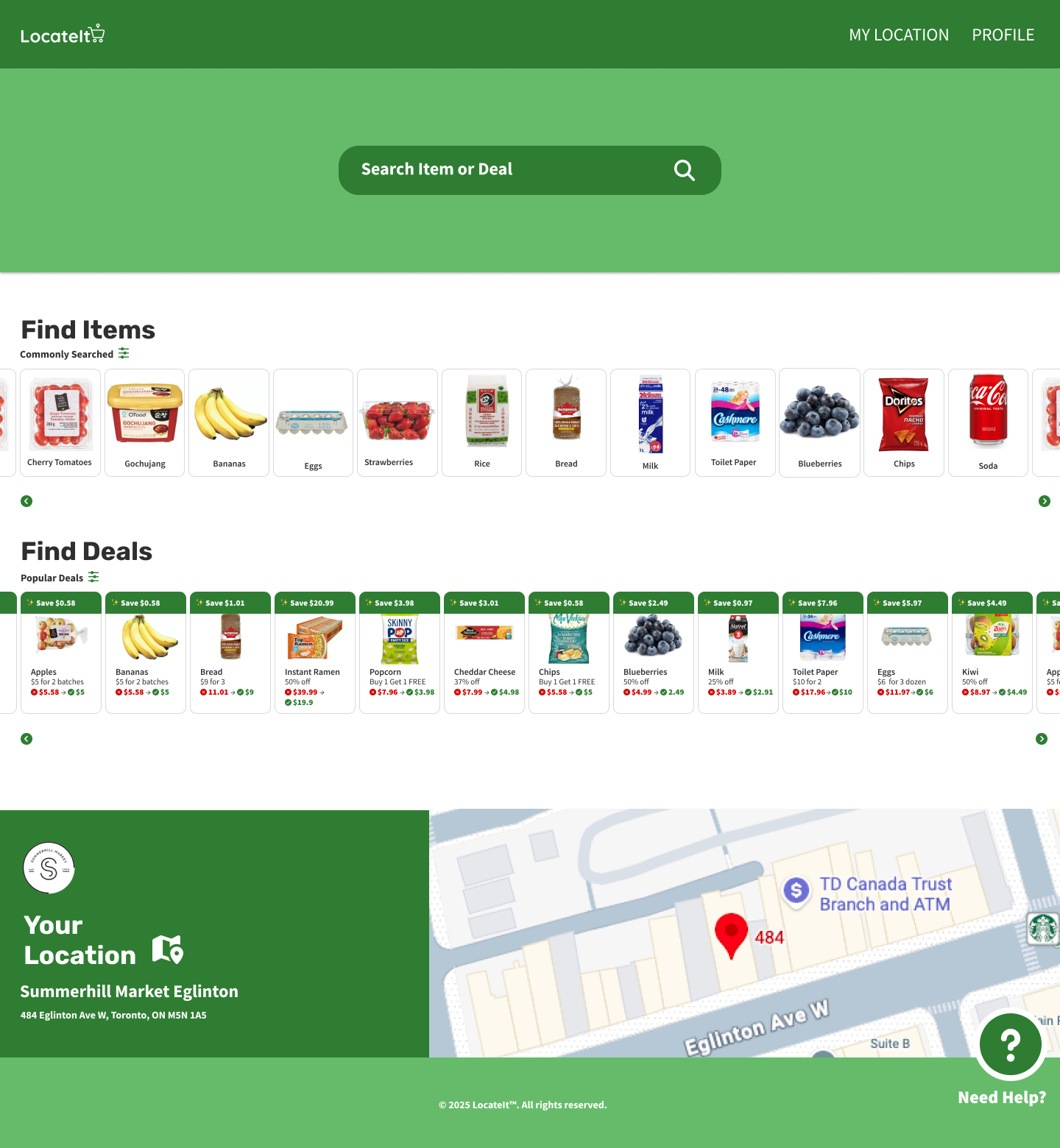
After empathizing with and understanding the potential users, I created a user flow and information architecture, along with quick paper wireframes that I later digitized in Figma.
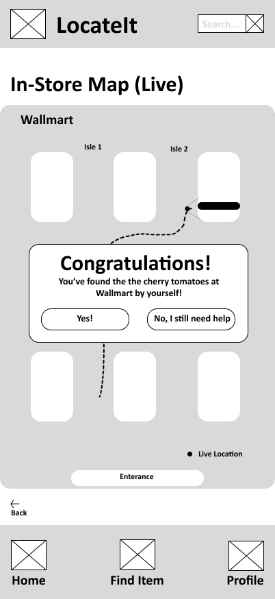
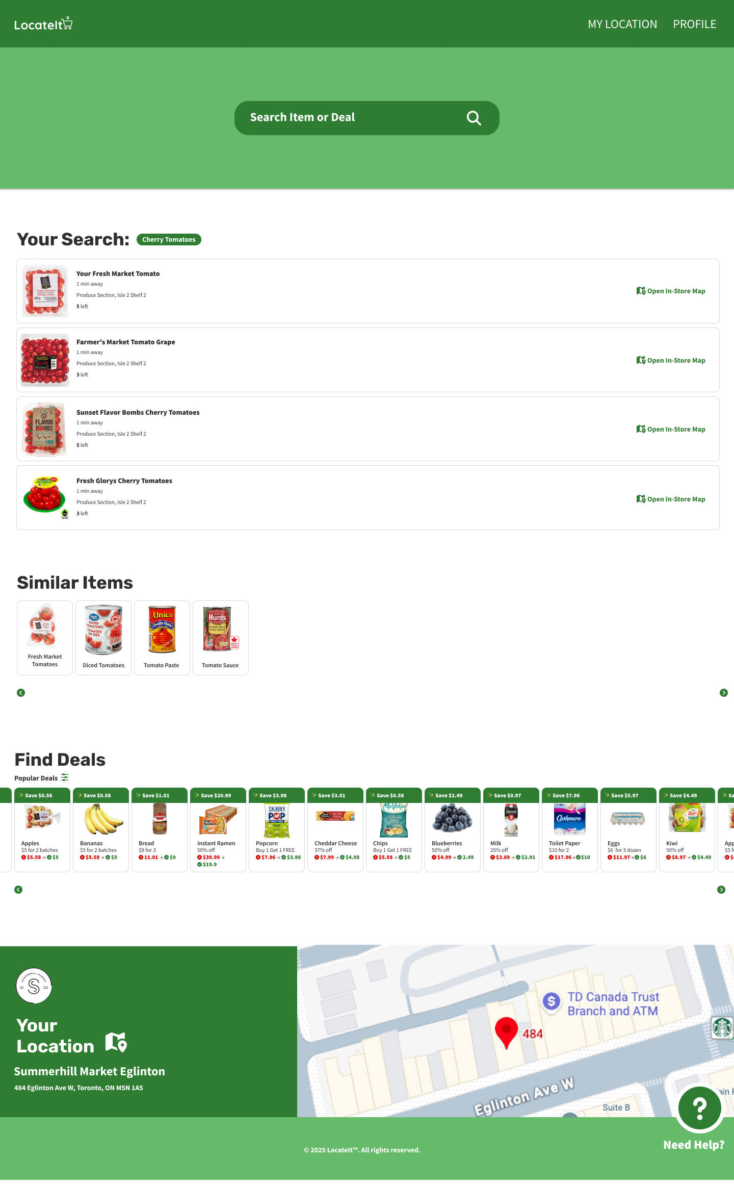
User testing was conducted through an unmoderated usability study in which participants were given a link to the prototype and asked to think out loud while completing key tasks, such as searching for items and navigating the app.
I synthesized the results using an affinity diagram, which helped identify several recurring patterns and insights:
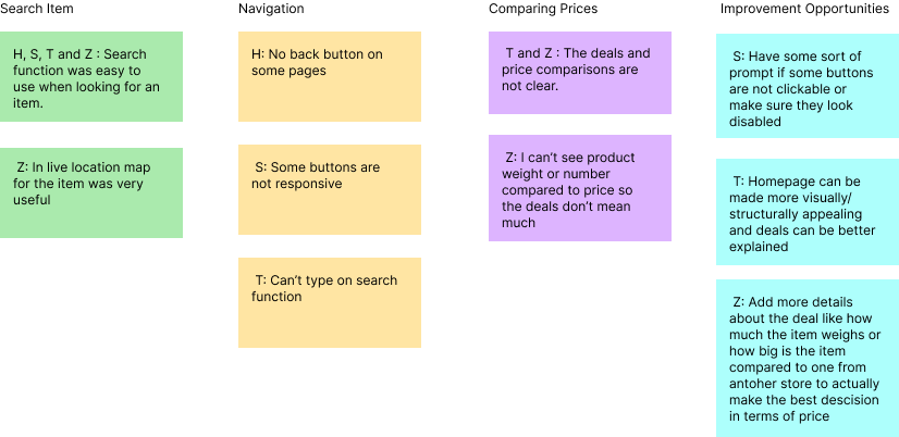
All 4 participants found the search function easy to use, indicating that searching for items is clear and effective for users.
2 out of 4 participants felt that deals were not explained clearly, suggesting that more detailed information about discounts, pricing, and deal conditions would improve understanding.
2 out of 4 participants were confused when comparing prices, showing that price comparison is not yet intuitive and needs refinement.
3 out of 4 participants experienced difficulty navigating between pages, indicating that the overall navigation structure should be improved to help users move through the app more confidently.
Most users experienced confusion when moving between pages, so improving the overall navigation structure is the highest priority. The app should use a clear and consistent layout with an always-visible bottom navigation bar and clear back buttons. This will help users understand where they are and move through the app confidently without getting lost.
Since finding deals is a core feature of the app and several users struggled to compare prices, the way deals are presented should be improved. Adding clearer price breakdowns, better visual organization, and more context about discounts will help users understand their options and make confident budget-friendly decisions.
One of the main challenges during this project was re-familiarizing myself with Figma. Although I had used it before, I was initially slow when setting up interactions such as defining where screens should navigate when buttons were pressed. I later realized that using components more effectively would have made this process much faster and more scalable.
Because I had not fully optimized my use of components early on, small design changes often required manual updates across many screens. This made iteration slower and highlighted the importance of planning reusable components from the start.
Another challenge involved color accessibility. While I originally aimed to follow the 60–30–10 color rule, I realized later in the process that my secondary green color (#66BB6A) did not meet accessibility contrast standards when paired with white text. To resolve this, I updated many backgrounds to use the primary green (#2E7D32), which better supports readability and accessibility.
A final constraint was participant recruitment. Due to limited resources, I conducted user research and usability testing with the same small group of participants. Since some of them were people I knew, their feedback may have been influenced by familiarity, which could introduce bias. Despite this limitation, their input was still valuable for identifying major usability issue
Despite these challenges, the final prototype successfully addresses the core user needs identified during research. Users were able to search for items, understand availability, and navigate toward their goals more efficiently than before. The design reflects insights gathered from usability testing and improves clarity, structure, and overall flow.
Next steps would include conducting broader and more diverse usability testing to validate findings at scale. Future iterations should focus on refining filter interactions, improving price comparison clarity, and testing live map behavior in more detail. These improvements would help ensure the experience remains intuitive, accessible, and reliable in real-world use.
Through LocateIt, I strengthened my ability to translate user research into clear design improvements. Testing directly informed changes to navigation and deal comparison features, resulting in a more intuitive flow. I also improved my component-based workflow in Figma and developed a stronger accessibility mindset throughout the design process.