DreamSeeker App


For our User Interface Programming class, our final project goal was to create a graphical user interface app using the Python framework tkinter. The user experience was designed to help people record, keep track of, and analyze their dreams in the most comfortable way possible.
DreamSeeker is a dream journaling app that allows users to record their dreams with the date and time, either through text input or speech-to-text for faster capture. This feature is intentional because people often forget their dreams quickly after waking up. To minimize this, users can create a journal entry and record their voice as they describe their dream instead of typing everything out.
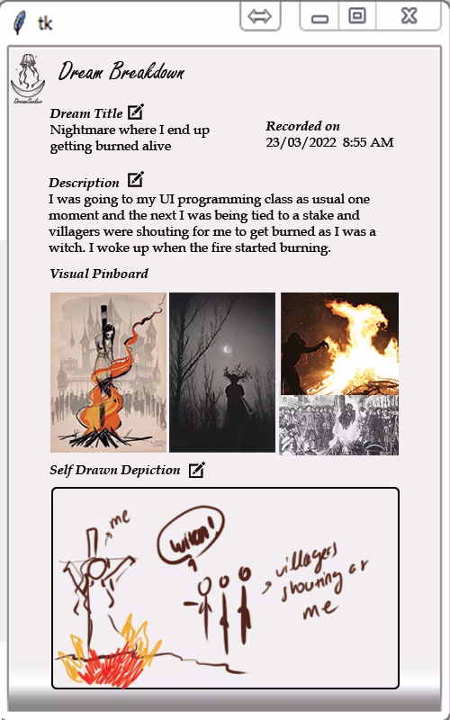
For organization, users can color-code entries. For example, black can be assigned to nightmares and yellow to happy dreams. Users who want to analyze their dreams further can enter the key elements they saw, and the app will generate related images that they can arrange into a collage to create a visual pinboard of their dream. Users who want more control over the visual representation can also draw their dream and save their illustration in the journal.
I created a moodboard in Figma using images collected from Pinterest to establish the theme and overall feel of the app. Since DreamSeeker is a dream journaling tool, it appeals to people who want to connect with their spiritual or creative side. The moodboard evokes feelings of wonder, awe, and fear, which reflect the wide range of emotions linked to different types of dreams and nightmares.
Overall, the moodboard depicts an out-of-body, surreal atmosphere that aligns with the visual pinboard feature of the app. This feature works by identifying nouns from the dream description and generating images so that users can visually represent what they saw. The app’s layout is intentionally simple, allowing users to add new dreams without navigating back to the homepage. The “Add Dream” page is accessible directly from the journal page for convenience.
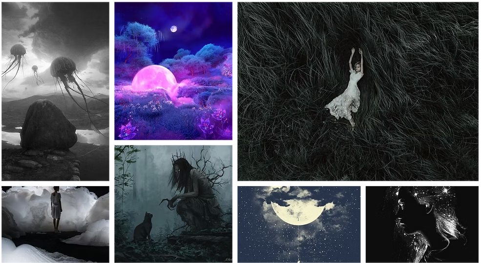
Moodboard for the DreamSeeker App.
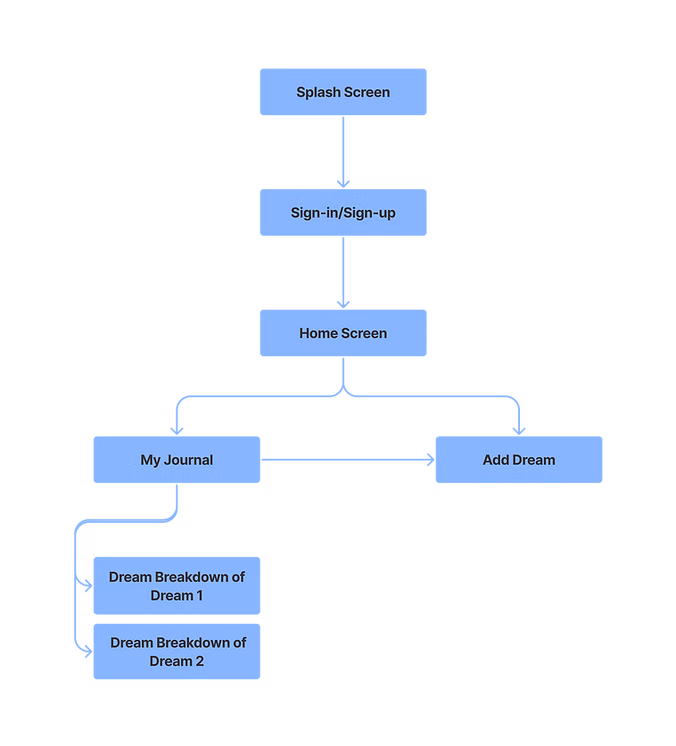
The information architecture creates a streamlined flow where users never need to return to the homepage to add a new dream. The Add Dream page is available directly from the journal, reducing unnecessary navigation.
I created low-fidelity wireframes as an initial exploration of the app's structure and user flow.
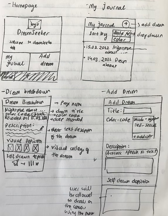
The homepage is simple and clearly presents two options: “My Journal” and “Add Dream.” The app's logo and name appear centered at the top, establishing the brand's identity.
The journal page displays a log of dreams that users can sort by date, title, or color. Color codes are assigned when recording the dream and can be customized based on how the user interprets the dream.
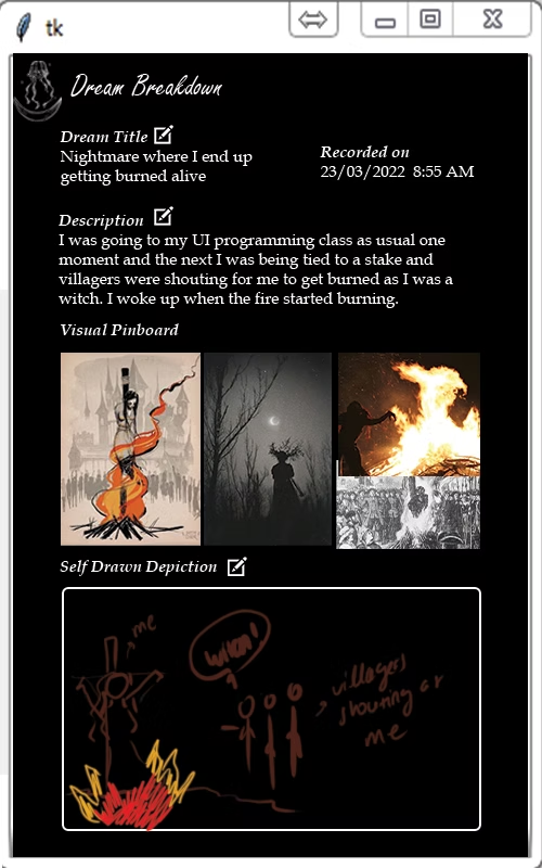
The Dream Breakdown page appears when a user selects a specific dream. It displays the dream title, description, visual pinboard, and the user's drawing. Users can edit the title, color code, description, and drawing, then save updates by tapping the pen icon.
Users can add a dream either through the homepage or by clicking the plus icon at the top right of the journal page. The date is recorded automatically, while the title and description are required. Drawing the dream or assigning a color code is optional and can be edited later in the Dream Breakdown.
Sketches of the initial logo design.
I wanted the logo to reflect the dreamy, creative, and serene atmosphere of the app. While building my moodboard, I found an illustration of a floating jellyfish and thought it would work beautifully with a crescent moon. I sketched a few concepts by hand before recreating them in Adobe Illustrator.
At first, I experimented with placing the jellyfish upside down to create a surreal feeling, but it worked much better upright against the crescent moon.
In the final design, the floating jellyfish gives a calming, graceful impression, while the crescent moon and sparkles evoke nighttime. The colored version includes a subtle outer glow around the moon, which works best on darker backgrounds and enhances the sense of mystery and serenity. The typography, Freestyle Script, complements the curves of the illustration and adds an organic feel to the logo.
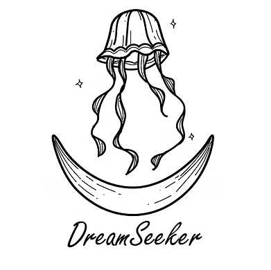
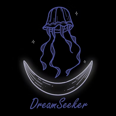
Finalized logos for the DreamSeeker app in day and night modes.
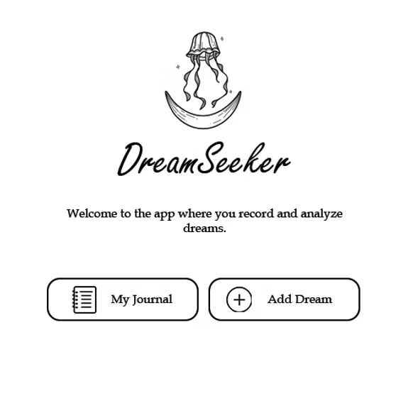
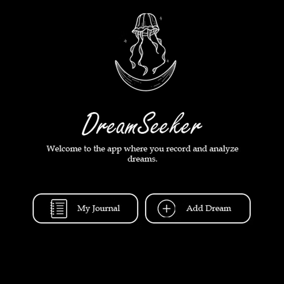
High fidelity wireframes in day and night mode of the Homepage and Dream Breakdown pages.
For the high-fidelity wireframes, I kept the design simple and offered both day and night modes. Users might wake up in the middle of the night to record a dream, and a bright interface can be uncomfortable, so the dark mode option creates a more soothing experience.